Welcome to the second part of the article: How does Clarity of the checkout process help CRO? In the previous article, we discussed the importance of using descriptive CTAs and keeping the primary button consistently placed throughout the checkout process. Now, we will talk about three additional ways to improve the checkout experience: making the next action button the most prominent feature, incorporating checkout FAQs, and simplifying the header and navigation. By implementing these strategies, you can make the checkout process smoother and easier for your customers, ultimately increasing conversions and sales.
The clarity of the checkout process is crucial for online shopping as it can determine whether a customer completes a purchase or leaves the shopping cart abandoned.
Elements:
- Clear and concise instructions throughout the checkout process
- A prominent and easy-to-find checkout button or link
Solutions and suggestions:
Is the placement of the primary button consistent on every step of the checkout process?
The consistency of the primary button placement throughout the checkout process is crucial for optimizing the conversion rate of an e-commerce website’s checkout page. The primary button, such as “Buy Now” or “Checkout”, is the most important call-to-action on the checkout page, and its placement should be consistent across all steps of the checkout process to avoid confusion and ensure a smooth user experience. If the primary button is moved or placed in a different location on different checkout steps, it may lead to disorientation, abandoned carts, and lost sales.
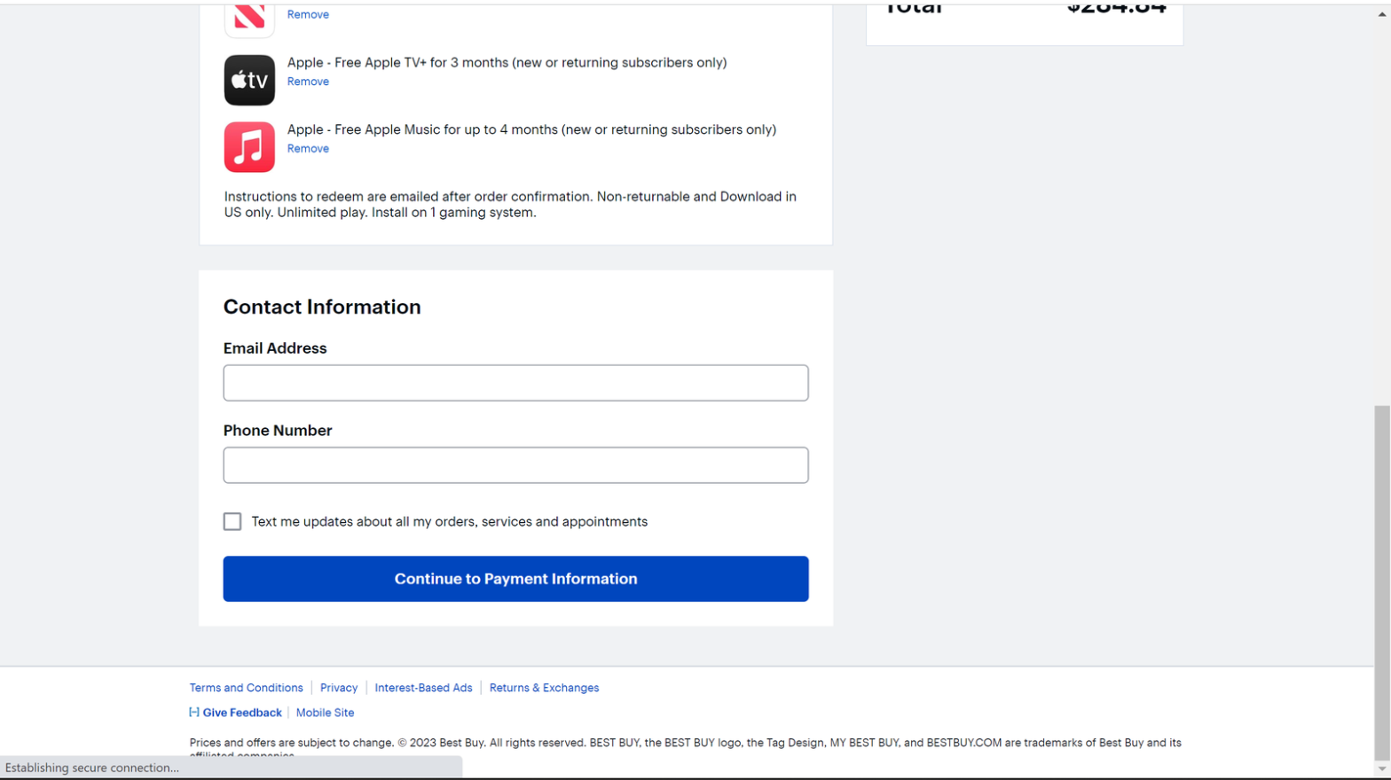
Good example from Best Buy Website:
Best Buy’s e-commerce website maintains consistent placement of the primary button, which is always located at the bottom of the screen, prominently displayed in a bright blue color, regardless of which checkout step the user is on.

Have you included a progress bar when there are multiple checkout pages?
One crucial feature to include on a checkout page with multiple steps is a progress bar. A progress bar can help users understand how many steps are left in the checkout process, reducing the risk of confusion and frustration. When users have a clear understanding of how much longer the checkout process will take, they are more likely to continue with their purchase. The progress bar should be prominently displayed at the top of the page, clearly indicating the current step and how many steps are remaining.
A good example from dermalogica Website:
The checkout process of dermalogica.com is a good example of a clear progress bar that shows customers how many steps they need to complete before placing their order. The progress bar is simple, clean, and easy to understand, guiding customers through the checkout process.

A bad example from Urban Outfitters:
The Urban Outfitters’ checkout process is a bad example of the lack of a progress bar, which can make it difficult for customers to understand how far along they are in the process or how much longer it will take to complete their order.

Do you link out or put the top checkout FAQs on the checkout page?
In terms of optimizing the conversion rate of checkout pages, it’s important to provide customers with easy access to frequently asked questions (FAQs) about the checkout process. One approach is to include a link to a dedicated FAQ page or section within the checkout page itself. This allows customers to quickly find answers to common questions and reduces the likelihood of confusion or frustration during the checkout process. Additionally, including the top checkout FAQs directly on the checkout page can be helpful in reducing the need for customers to navigate to a separate page.
A good example from Fossil website:
The e-commerce website, Fossil, provides an excellent example of including top checkout FAQs on the checkout page. They have a section labeled “Have a Question” on the right side of the checkout page that includes FAQs, such as payment methods and shipping options.

A bad example from GAP’s:
GAP’s checkout page does not provide a link to any checkout FAQs, which can make it difficult for customers to find answers to their questions. While there is a “Help” section on the website, it is not easily accessible from the checkout page, and there is no clear information on where customers can find answers to specific questions related to the checkout process.

Have you simplified the header and navigation?
One important aspect of optimizing the checkout page for conversions is to simplify the header and navigation. Customers should not be distracted by irrelevant information or links that could lead them away from completing their purchase. Removing unnecessary links and simplifying the header can help to keep the focus on the checkout process and reduce the risk of cart abandonment. It’s important to keep the header consistent with the rest of the website, but to also remove any links that are not relevant to the checkout process. A clear and simple navigation menu can also be helpful in guiding customers through the checkout process. Also, Minimize header distractions and links away from the checkout page.
A good example from Nike Website:
Nike.com simplifies the header and navigation on their checkout page by removing the main navigation bar and keeping only the logo and a single link to live chat. This reduces distractions and allows customers to focus on completing their purchase.

Conclusion:
In conclusion, a clear and straightforward checkout process is crucial for the success of any e-commerce website. By minimizing distractions, providing clear instructions, and optimizing the layout and design of the checkout page, online retailers can increase their conversion rates and boost their revenue. In the next article of this series, we will focus on user-friendly design and the adequate number of steps on the checkout page. Stay tuned for more insights and best practices on optimizing your e-commerce website’s checkout page for conversions.