In the world of e-commerce, a fast loading checkout page is crucial for a successful conversion rate optimization (CRO) strategy. In our previous article, we discussed the impact of loading time on the checkout page’s CRO. However, there is another important factor that can significantly affect the CRO of a checkout page: mobile responsiveness. With the rise of mobile devices as the primary tool for online shopping, it is more important than ever to ensure that your checkout page is optimized for mobile users. In this article, we will explore the effects of mobile responsiveness on the CRO of the checkout page, and provide tips for optimizing your checkout page for mobile devices.
Mobile Responsiveness
Introduction: Mobile responsiveness is a critical factor in the success of any online business, especially when it comes to the checkout page’s conversion rate optimization (CRO).
Elements:
a. Responsive design and touch-friendly buttons
b. Simplified checkout process
c. Testing and optimization on different devices
Solutions and suggestions:
Is your website optimized for mobile devices by using responsive design practices including appropriate font sizes, touch-friendly buttons, and easy-to-use forms?
To ensure that the checkout process is seamless and efficient for users, it is essential to optimize the website for mobile devices using responsive design practices. This includes:
- Appropriate font sizes that are easily readable on smaller screens (Use a minimum size of 16px and ensuring that the font is legible against the background)
- Touch-friendly buttons that are big enough to be tapped without difficulty (Use a minimum size of 44px by 44px and provide enough spacing between buttons to prevent accidental clicks.)
- Easy-to-use forms that are optimized for mobile devices (Use form fields that are easy to fill out on mobile devices, with larger text input fields and clear labels for each field.)
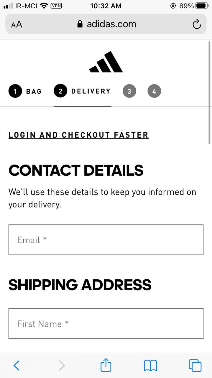
A good example from the Adidas Website:
The page is optimized for smaller screens, with larger fonts, easy-to-use forms, and touch-friendly buttons. The page also includes clear instructions and guidance, the page loads quickly and is designed to minimize distractions.

A bad example from the GNC Website:
The checkout page of gnc.com is an example of a poorly designed and optimized mobile-responsive checkout page. The page is cluttered and overwhelming, with small fonts, difficult-to-use forms, leading to frustration.

Is your checkout process simplified and streamlined by removing unnecessary steps that could potentially slow down the checkout process on mobile devices?
To improve the CRO of the checkout page on e-commerce websites, it is essential to simplify and streamline the checkout process. This can be achieved by removing unnecessary steps that can slow down the process, particularly on mobile devices. Such unnecessary steps include forcing users to create an account and asking for unnecessary information. To streamline the checkout process, consider features such as guest checkout options, third-party payment gateways, and simplifying the checkout form. By simplifying the checkout process, you can increase the likelihood of completing a sale and improve the CRO of your e-commerce website.
A good example from Jet.com:
The checkout page of Jet.com is a great example of a simplified and streamlined checkout process on mobile devices. The page includes only essential form fields and buttons, making it easy for the user to navigate and complete their purchase. The page also includes a progress bar, indicating how far along the user is in the checkout process, which can help reduce anxiety and increase trust. Additionally, the page loads quickly, making the checkout process fast and efficient.

A bad example from ToysRUS.com:
The checkout page of ToysRUs.com is an example of an overly complex and confusing checkout process on mobile devices. The page includes too many form fields and buttons, making it difficult for the user to navigate and complete their purchase. Additionally, the page lacks a progress bar or any clear indication of how far along the user is in the checkout process, which can increase anxiety and lead to cart abandonment. The page also loads slowly, making the checkout process frustrating and time-consuming.

Do you test and optimize your mobile checkout page to ensure that it performs well on a wide range of mobile devices and that it is easy and efficient to use?
Ensure that the mobile checkout page performs well on a wide range of mobile devices and is easy and efficient to use, businesses need to conduct regular testing and optimization. This can involve testing the page on various mobile devices with different screen sizes and resolutions, as well as ensuring that the checkout process is streamlined and intuitive. It’s important to keep in mind that mobile users have a shorter attention span and less patience for slow or cumbersome checkout processes. By testing and optimizing the mobile checkout page, businesses can improve user experience, increase customer satisfaction, and ultimately drive more sales.
A good example from Amazon Website:
Amazon’s mobile checkout page is a great example of optimization for mobile devices. The page is clean and easy to navigate, with a progress bar indicating the checkout process’s various steps. Moreover, the page is optimized for quick loading times, even on slow connections.


Conclusion:
To conclude, mobile responsiveness is crucial for the success of any online business. By implementing a responsive design, touch-friendly buttons, and optimization on different devices, you can provide a seamless user experience across all devices and increase your chances of converting visitors into customers. However, even with a perfectly designed checkout page, data entry errors can still occur, leading to frustration for your customers. In the next article, we’ll dive into best practices for minimizing data entry errors and crafting effective error messages to keep your checkout process smooth and stress-free. Stay tuned!