You may have a virtual store or a website that offers various services to users, or you may have different roles in the marketing, product, or IT teams of e-commerce websites. The important thing is that, like any user wandering in the virtual space looking to solve a problem, you ask yourself questions when you encounter an e-commerce product!
Finding answers to your questions quickly and clearly on a website helps you purchase its services or products faster. But when facing an e-commerce website, what questions do we ask ourselves?
Below are the first first questions that you should ask yourself about the product:
Are you confirming to new visitors that they’re in the right place?
Users enter your website through various channels (such as directly from Google, advertisements, directories, or directly), but they all have some key questions in mind when they arrive at your website. Your first task is to answer these questions so that the user doesn’t drop off in the first few seconds of their visit and enters your desired flow. Although there is no general version for all websites, generally these questions are:
- Will I find what I’m looking for here?
When a user enters a website, they definitely have a need that they have come here for. A need for a service, a product, or even an article. Therefore, it should be immediately apparent whether they will find what they are looking for here or not.
- Are the products I want to buy found here?
If a user is looking for a specific product to buy, they need to make sure that your website is selling that product. For example, they should immediately understand that you are selling women’s clothing, not laptops!
- Why should I shop here and not somewhere else?
To answer this question, we usually use the USP (Unique Selling Proposition) on the homepage or product page. For example, we write a sentence or highlight our top services compared to other competitors. Of course, generally, to answer this question, we need to convey the following questions to the user in the first place:
- Do we have the best price on the market?
- Is this product exclusively offered in our store?
- Do we deliver the product on the same day?
- What do I do next?
Users are always looking for a clear and specific CTA (Call To Action) that illuminates the path for them to continue. So, there should be “only one CTA”, and it should be clearly present in front of them.

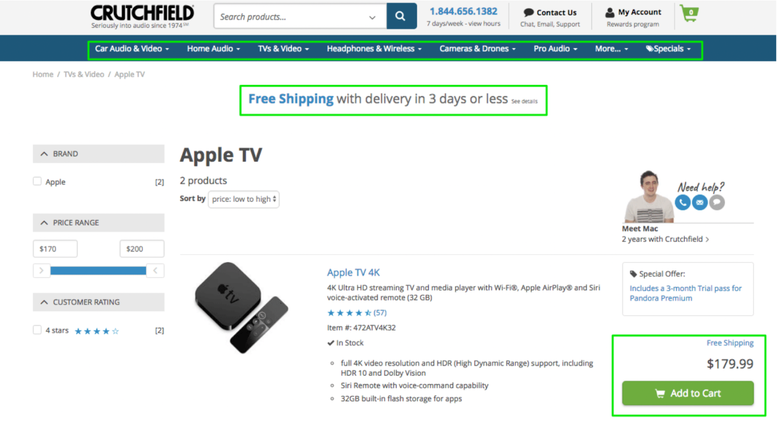
The Crutchfield website has effectively addressed all the above questions:
(1) By viewing the headline and top section of the page, the user can fully understand what is being sold on this website.
(2) In the middle of the top section, the website’s Unique Selling Proposition (USP) is briefly and clearly explained.
(3) The main CTA button on the page stands out from all other colors and clearly directs the user to the next step, which is purchasing the product. The user’s eyes are certainly drawn to the green CTA button at first glance (also, all linked items are displayed in blue).
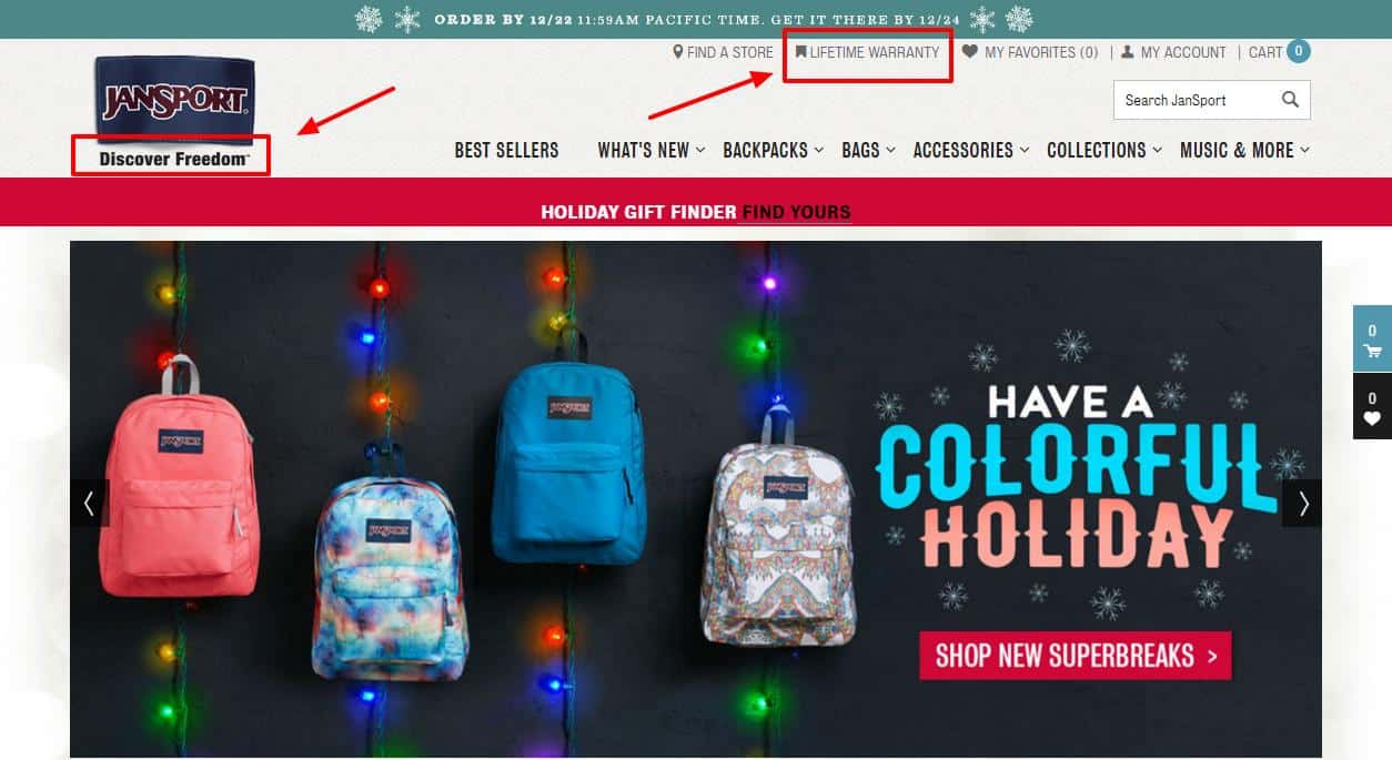
The Jansport website also answers these questions on the home page and above the fold section.
(1) Using a slogan and a carousel image, the website introduces the product to the user at first glance.
(2) The menu headings and carousel images introduce the products to users.
(3) Values such as lifetime warranty and better shopping with gift finder distinguish the product.
(4)The CTA in the carousel specifies a clear path for the user.

Neo Law Group is a legal group focused on non-profit projects and on the homepage:
(1) By writing the phrase “law group” under the group name, it clearly introduces the website to the user.
(2) The displayed phrase in the carousel introduces the group’s focus on non-profit projects to the user.
(3) The distinctive color of the CTA in the carousel provides a clear path for the user.

Website Partake:
(1, 2, 4) Upon entering the website, it introduces the user to the products and goods that it offers.

(3) Its proposed values of using quality primary ingredients and being allergen-free are displayed.

Almond Surfboards website:
(1) The website introduces itself to users with the phrase “surfboards” which is present in its name and logo, and with carousel images.
(2 and 4) It showcases its products through menu titles and carousel, and provides solutions to users for further action.
(3) It also displays its distinguishing factors and financial offers to users.
Does your site effectively build trust?
Creating a secure and reliable platform is the first step in keeping a user on your website. At first glance, the user receives several micro-impressions of your website, which, as a result, either make him trust or not trust your website (if your website is for providing services or selling goods, the most important part of your work is gaining the customer’s trust). So, considering the following, a significant portion of user trust can be gained:
- Professional design
- The number of customers or clients you have
- The number and nature of user comments (especially on the product page)
- Number of years in business (e.g. established in 1985)
- Testimonials
- Contact information
- Awards and achievements
- Secure domain or https
- Secure payment options
Of course, it is not recommended to use all of the above items on one page. For example, you can use testimonials, contact numbers, and awards on the home page. And also use user comments and secure payment options on the product or checkout page to gain user trust.
Please refer to the checkout page below:

At the top of the page, you can see the https along with the green icon (indicating a valid security certificate). In addition, you can also see the Comodo security badge on the top right of the page. These badges and symbols assure the user that they can make purchases from this website with peace of mind.

On the Neo Law Group website, below the fold:
- Prominent lawyers of the group and their legal achievements are displayed to the user.
- The trusted site label is displayed at the bottom of the page and attracts the user’s attention and trust.

On the Partake website, to attract user satisfaction:
- User testimonials are displayed.

- Providing access to frequently asked questions and ways of access.
- Introducing the standards that are being observed.


On the Puravida Bracelets website:
- Testimonials from customers are displayed.
- Multiple access addresses and ways are provided to the user.
- A section titled “Help” exists to guide the user throughout the purchase process of this product.
In the upcoming articles, we will discuss more questions, tips, and tricks to optimize the conversion rate of different pages (from the homepage to checkout pages).
What is conversion and why is it important on a website?
Conversion refers to the number of users who have taken a desired action in a product. When a user asks questions about each stage of the product funnel and receives clear answers, they are more likely to take the desired action (such as purchasing a product or service) quickly. In terms of the product funnel, the percentage of users who can complete the entire customer journey and the percentage who drop out of the funnel can indicate the conversion rate.
However, conversion is not a binary approach, meaning that the user does or does not succeed in taking the desired action.
To analyze conversion in products, we examine the conversion path, which is the process that a user goes through in a product and ultimately turns from an unknown visitor to a lead customer.
/Imported_Blog_Media/hubspot-conversion-path-750x342-2.png?width=750&height=342&name=hubspot-conversion-path-750x342-2.png)
The main objectives of conversion are macro-conversions, which are the ultimate goals that we want the user to achieve. To determine macro-conversions for an experience in a product, we use primary purposes and OKRs.
Micro-conversions are actions that lead to macro-conversions. These micro-conversions may not be valuable on their own, but they indicate user interaction and progress towards achieving macro-conversions.
For example, clicking the “subscribe” CTA on the Amazon website is a micro-conversion that ultimately leads to a user purchasing a product (macro-conversion). By using CRO, we can identify the touchpoints in the product funnel that act as obstacles to the user and remove them. The advantage of this is an increase in the conversion rate, which is beneficial for the website.
Using CRO, we identify micro and macro goals and can identify and address friction points in the funnel that hinder user actions. The advantages of using CRO for e-commerce products include:
- Reducing customer acquisition costs
- Increasing the value of existing website members
- Increasing revenue per visitor
CRO consists of two parts: data analysis and UX.
With data analysis, we can understand at which touchpoints the users are dropping off (what is happening?) . With UX, we can identify the user experience at these touchpoints (why it is happening?) .