In the previous article, we came up with a checklist of initial questions that users have about your website. However, in most cases, which page on your website do users typically encounter first? Worldwide E-commerce statistics have shown that the homepage of every e-commerce website is the most important page for user landing. Generally, the marketing sector of websites put any advertising links, physical advertisements, click ads, etc. on the homepage to attract users to it (although in some cases, the landing page of a specific campaign may be chosen as the landing page. However, none of the internal pages of an e-commerce website have as much traffic as the homepage).
And here we have provided the checklist number 2 for optimizing homepage.
Does your home page pass the “5-second test”?
Research shows that when users visit your website for the first time, they typically give you between 0.5 and 2 seconds to make a clear introduction. Rather than reading your website, they tend to scan it. As a result, we have developed a usability test called the “5-Second Test” to evaluate the user scanning process.
In this test, you must display the homepage of your website to new users for only 5 seconds, then close the page and ask them a few questions. The better the users can remember the points about your website and provide clearer answers to your questions about your website’s purpose, important headlines, important images, increased trust, products available for purchase, and the main call-to-action of the page, the more optimized your homepage will be. We have provided a checklist of questions that you can ask the user during the 5-second test.
- What do you think this page was about?
- What product do you think this company sells?
- What’s your first impression about the site?
- What grabbed your attention?
- What words or sentences can you recall?
- What colors do you remember?
- What pictures do you remember?
For example, look at the image below for 5 seconds, and then answer the questions above.

This is the homepage image of a sign company that specializes in installing various types of signs (boards).
- What words, images, and colors caught your attention?
- How closely does the information you obtained relate to the product, and did you easily find out what you needed to do or which section to refer to next?
Now, take 5 seconds to look at this homepage:

This website operates in the field of selling movie tickets and broadcasting trailers and reviews.
- What do you remember from viewing the homepage, and how closely does this familiarity relate to the product?
Also, try the 5-second test on this website and answer the questions:

This website produces various types of Custom-Made leather balls.
- What knowledge have you acquired about this product, and how closely does the gained knowledge align with the actual product?
Do you follow visual hierarchy on the homepage, and is it visually simple without being overloaded?
Creating a hierarchy to organize the content of a web page can help the audience understand it at a glance and direct them more quickly toward your desired goal, such as making a purchase. Visual hierarchy refers to how we attract the user’s attention to a specific point on the website that we want them to focus on. To ensure a proper visual hierarchy on the homepage, we have provided several design tips below.
- The first section of your page, commonly referred to as the “hero” section, is the most crucial part of your page. The content hierarchy in this section must be carefully observed more than anywhere else, because it is the first image that a user sees when they visit your homepage. They should be able to quickly understand what your website is about in less than a second.
- To draw the user’s attention to a specific element on the page, you should make it stand out from the surrounding elements. For example, using a different color and larger size for a call-to-action (CTA) than the surrounding items will definitely grab the user’s attention more.
- The more prominent an item is on a page, the more attention it attracts. For example, if the background of your website is white, an orange call-to-action (CTA) will attract more attention than a gray one. Therefore, we suggest using contrasting colors for elements that need to grab users’ attention.
- The higher an item is positioned on a website page, the more important it appears. This is because a lower percentage of users typically scroll down to the end of the page and reach the bottom. Therefore, you should prioritize displaying the more important items higher up on the page.
- Try not to place different elements too close to each other, as they will compete with each other. For example, give more white space near the main call-to-actions (CTAs) and product value propositions, so that these elements stand out more.
Try not to include too much data in the first section. The standard for the hero section of an e-commerce website is as follows: one image, one title, one optional subtitle, and one main call to action (or multiple main CTAs, such as offering a purchase discount on multiple top products to new users).
Now, we have provided a few examples of correct and incorrect homepages in terms of visual hierarchy:

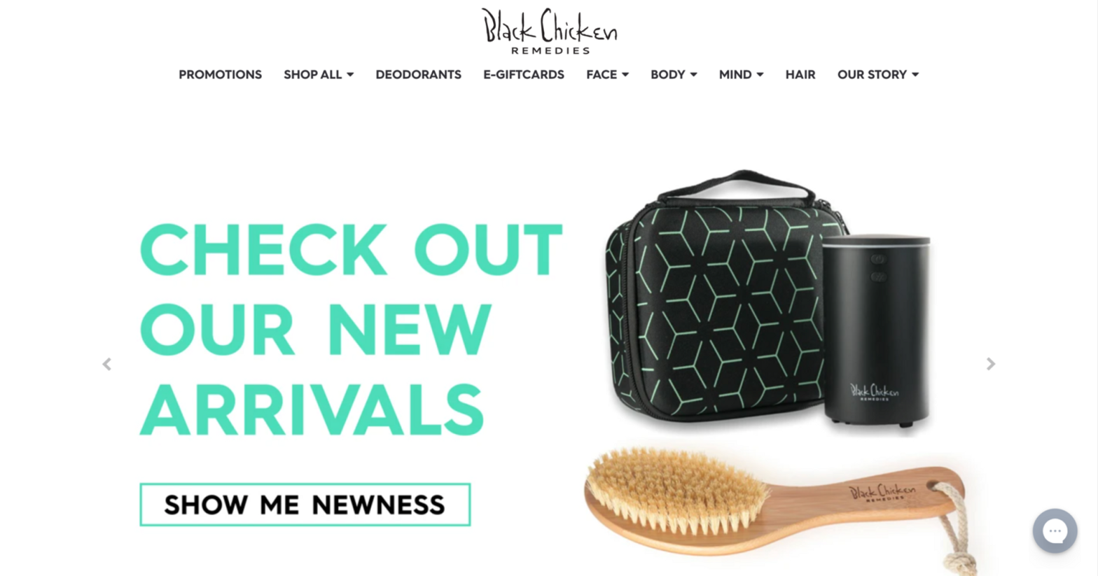
1- A bad example after visiting the Black Chicken website:
- It does not have visual hierarchy
- Multiple elements are placed on a single screen and draw the user’s attention to them.
- The main CTA button is not prominent.
- Two sections are seen on one screen.
- The two notifications displayed at the top of the page draw more attention than the section where the main CTA is located.

2- A bad example from Sutra website:
- In the first section, they have not presented any value proposition or offered any products.
- There is no call-to-action (CTA) in the first section.
- The title “Our Mission” is the most prominent element on the first screen and grabs attention, but it is actually the beginning of the second section that is not visible at first glance and serves little purpose.
- The size of the free shipping and guarantee icons is almost the same as that of the recommended product, thus stealing the user’s attention.

3-An example of the American Eagle website that can be improved:
- All aspects of this page are properly arranged, such as the eye-catching image and the prominent offer in the hero section. However, the following two items need to be improved:
- The CTA button needs to be made more prominent.
- Using a white background for the CTA and increasing the button size make it more eye-catching.
- 4- A good example of Allbird and Leesa websites
- The title and subtitle that specify the value proposition are both clear and eye-catching.
- The CTA button is prominently placed and set apart from other elements by white space.
- User attention is precisely directed towards the action that we want them to take, which is clicking on the CTA button.


Does your homepage look good both on mobile and desktop devices?
Based on research conducted in 2021, 70% of customers who use e-commerce stores visit these websites via their mobile devices. This may be why designers have recently started designing pages for mobile devices first before creating the desktop version.
- Clutter on a mobile page can occur when multiple elements such as text, buttons, and so on are part of an image (placed in the HTML code). Therefore, it is suggested to first consider mobile UX and then focus on desktop design. Below are a few points to consider when designing a mobile e-commerce website.
- Never use photos that have elements such as text, buttons, and so on included on them. Instead, each element should be included separately in the HTML code.
- Design the mobile and desktop versions separately, which means that the layout of sections, images, menus, etc. does not need to be exactly the same on both platforms. A different UX can be considered for each.
- While desktop and mobile designs are often consistent with each other in many touchpoints such as titles, subtitles, text, buttons, and other textual elements, it is possible that the size and color of other elements may not match on desktop and mobile. In such cases, creating a new design for mobile users using special media CSS is an easy solution.
First example:
- On the desktop version of the FashionNova website, everything is displayed correctly, but on the mobile version, everything is the opposite, and the design is not user-friendly.
- The hero section contains an image with elements including text and a button. However, in the mobile version, this design causes the text’s bottom lines to become very small and unreadable. The button is also much smaller than it should be, making it difficult to attract the user’s attention. These issues have not been properly addressed in terms of visual hierarchy.


Second Example:
The website design for Black Chicken Remedies is well-done on desktop, but it displays poorly on a mobile device. Additionally, the website uses an image with accompanying text and a button on it, instead of placing each of these elements in separate HTML elements.


Third example:
Now let’s take a look at websites where the hero section design is displayed correctly on different screens.


Conclusion
In this article, we have presented a checklist for design an UX, with particular emphasis on the hero section, to encourage new users to become engaged with your website. Additionally, we have introduced the concept of the 5-second test, along with some illustrative examples, to deepen your understanding of user behavior. In forthcoming articles, we will offer further tips for homepage design and discuss other tests that can assist in understanding user behavior, and we will provide links to these articles for easy reference.