After viewing the homepage of our e-commerce website, users typically navigate to another page via the available menus or search bar, which we refer to as the product list page or PLP. This page is specific to a category or search that the user has selected, and it displays products to the user in the form of cards. This allows them to quickly locate their desired product and add it to their shopping cart. However, what features should this page include?
- How should we choose the name or category header for this page?
- What should be the product descriptions on this page?
- How should the rows of products on this page be designed?
We have presented the key points that need to be taken into account while designing a PLP page in the form of three articles. Below are three questions as the checklist of the first PLP article:
- How should we choose the name or category header for this page?
- What should be the product descriptions on this page?
- How should the rows of products on this page be designed?
How should we choose the name or header of the category for this page?
Do you have clear and understandable category names?
When browsing through a website, users typically prefer categories with “understandable” names rather than “creative” ones. This is especially true for e-commerce sites where creative category names can confuse buyers. Therefore, category names should be chosen in a way that allows users to immediately recognize which page they are on simply by reading the name.
When naming a category or header, keep the following points in mind:
- Choose simple words that people use in everyday language, avoiding creative terms that can be confusing.
- Avoid using adjectives unless necessary, such as in the case of “best seller.”
- Keep the name short, using no more than one or two words when naming a product category.
A bad example from Good American:
Below, we have included an example from the Good American website that illustrates how the use of obscure words in a category can be confusing for the user. They have a category called “Plus”, which is not absolutely clear what is it. I think that if they call it name “Plus size” it will be much more clear.

Are product images visible above the fold and there is a clear, visible header with the category name?
Typically, users utilize the PLP page to browse available products. When a user visits this page, their eyes are searching for two key items. If they cannot find them at a glance, they are likely to leave the page.
1- A suitable header category that explicitly tells the user “where it is located” with the name of the category.
2- Several products, along with their pictures and specifications, in the above-the-fold section.
By having these two elements at the top of the page, users are able to quickly recognize that they can search for the products they desire on that page, without the need for excessive scrolling. Furthermore, users can confirm that they are in the correct location.
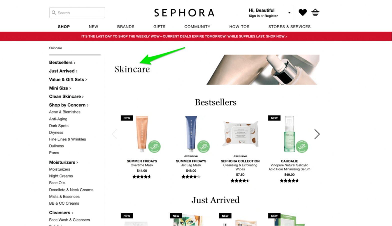
Example from Sephora:
Sephora’s PLP page includes a category headline and highlights top-performing products above the fold, thus satisfying the aforementioned requirements.

Do you have page description section on the bottom for SEO?
In order to provide users with more information about the details of the PLP page and improve the page’s SEO ranking, you can include a short text as a description on the page. However, it should not be placed at the top of the page! This text should be located at the bottom of the page to comply with the two guidelines related to “above the fold” that were previously mentioned. Please refer to the following example for further clarification:
They have dedicated section with description of a category in the bottom of each page.

What is the proper way to write product descriptions on this page?
Do you show prominent product titles?
The title is the second most important element on the PLP page after the product image. All of your products should have both a title and a description. This is because users who search for a product name on Google or your website’s search bar want to read a brief description of the product’s specifications at a glance. Moreover, having a description has a significant impact on SEO and product discoverability. However, it is essential to note that Google only displays the first 25, 50, or 64 characters of a title to users. Therefore, it is crucial to avoid writing long titles.
Consider the following example:
In this example, effective product and category titling, along with SEO optimization, leads the user to their desired results. The user searched for “Nike women’s black long sleeve shirt” and was presented with pertinent products and categories in the search results, featuring clear titles.

How should we design the row of products available on this page?
One of the most difficult decisions to make for a PLP page is how to display the row of products. In simple terms, you need to display the most suitable product at the top of the page to increase the chances of the customer selecting and buying it. Therefore, when deciding how to display the product row on the PLP page, consider the following points:
Do you show trending and best selling items on the top of category page by default?
Users often get lost in the sea of products, filters, and available options. However, displaying the trending and best-selling items at the top of the PLP page can undoubtedly make their decision-making process easier. Of course, remember to include a title for them and mention their trending and best-selling status; otherwise, users will not be aware of it.
An example from Kohl’s:
Popular and helpful categories have been placed in the top section of the PLP page.

Are you displaying the appropriate number of products per row?
When designing the PLP page, we face a challenge in deciding how many products to display in each row. The more information we include under a product image, such as the price, color, material, size, etc., the larger the product card becomes, resulting in fewer cards being able to fit in a single row. Therefore, it’s important to maintain a balance between the amount of information and the number of products displayed in each row.
In terms of visual design, it is better to display 3-4 product cards in each row. However, for technical products, it can be 1-3 cards per row.
A bad example from BeardBrand:
There is no reason for the product images to be so large as there are no important details in the image. Instead, five images could be shown in a single row.

A good example from Mavi:
To effectively showcase the products, it is important to display them being worn with other clothing items. This is why they have opted to show three products per row with large images.

A good example from the B&H website:
Since they are selling specification-driven products, it is important to display a plethora of product details in each card. As a result, they prefer to showcase only one product per row.

A good example from LuxyHair website:
Since displaying the details are not crucial and they only need to display the color of the clip-ins, they have chosen to have five products per line.

Are unavailable products only shown towards the end of the listings?
One major issue on the PLP page is the display of out-of-stock products. Placing these products at the top of the page or randomly among available products completely ruins the user experience regarding the list of available products and has a negative impact on the conversion rate.
The most appropriate place to display out-of-stock products on the PLP page is near the bottom of the page. After displaying all available products, you can show out-of-stock products on the last pages or at the bottom of the page. Please refer to the following example:
An example from Wayfair:

In conclusion, the name or category header, product descriptions, and design of rows of products on your e-commerce PLP page are all critical elements that can significantly impact your conversion rate optimization (CRO). By carefully selecting compelling category names, crafting persuasive product descriptions, and implementing an intuitive and visually appealing design, you can create an engaging shopping experience that entices customers to make purchases. Remember to continuously evaluate and refine these aspects based on user feedback and data analysis to drive continuous improvement in your CRO efforts.
Next, in our series on PLP optimization, we will delve into the importance of effective product filtering and sorting mechanisms. Stay tuned to learn how to empower your customers with seamless navigation and enhanced search functionalities, enabling them to find their desired products quickly and efficiently.