So far, two titles of the PLP checklist articles have been checked. In the third article, we provide another checklist of essential points for enhancing the user experience on your page. By considering all the points mentioned in these three articles, you can optimize your PLP page effectively. By following each of these points, you will see a significant impact on your conversion rate. This article covers the following topics:
- How should we design the CTA button for higher conversion rates?
- How should we design menu filters on the PLP page?
- How should we design the sorting menu?
We have provided you with three articles on the key points that you should consider when designing a PLP page:
How should we design the CTA button to have a higher conversion rate?
Do you have CTA-button to motivate users go further into the funnel?
Many assume that users on the PLP page already understand that clicking on the title or product image will take them to the product’s inner page for further information. However, A/B test results indicate that having a button to direct users to the inner product page improves conversion rates and increases the number of users who reach the next page. The crucial point, however, is to have a relevant CTA on the PLP page. For instance, many websites use the “Add to Cart” button on the PLP page. When was the last time you added a product to your cart without reading more about it?
Certainly, suggesting that users add the product to their cart from the PLP page is not advisable since we always want more information about a product before making a purchase decision. Therefore, including a button such as “Read More Information” may be a better solution.
Of course, depending on the type of products sold on the website, the CTA may vary. For example, for partial products, like supermarket products, users may not need to read many details. Clicking on this button could direct the user to the details page or display the product’s details in a pop-up window.
Below are some suggestions for placing CTAs on the PLP page:
- Use phrases such as “View Details,” “Shop Now,” or “Learn More.”
- Use “Add to Cart” when the product has few details, such as supermarket products.
- Use two CTAs simultaneously and make one more prominent, such as “Add to Cart” and “View Details,” where “Add to Cart” is more prominent.
- Use “Quick View” and display a modal with a few product details to the user.
- In the desktop version, use a fixed button and a button that appears when hovering over the product card.
A good example from leatherheadsports:
The CTA text, “Shop Now,” on the PLP page is aligned to the right. By clicking on it, the user will be directed to the PDP page, where they can find the “Add to Cart” option.

A good example from Tinyritauls:
This website uses the “Add to Cart” button prominently on its PLP page because it sells very simple products. This allows the user to add products to their cart without the need to open a details page and then add to the cart.

How should we design menu filters on the PLP page?
Is the filter section prominent enough?
If you want users to use filters, they must first notice them. If the filters are visually ambiguous in priority, users will not notice them and will not use them. If you want to encourage people to use filters to quickly find their desired item, you should highlight them sufficiently.
There are standard rules for displaying filters on the PLP:
- They should be visible above the fold so that users can quickly see them and search for their desired products upon entering the category page.
- They should be placed on the left side only because users are accustomed to this layout. Therefore, do not deviate from this pattern.
- Use colors and dividers to distinguish the filters section from the rest of the page.
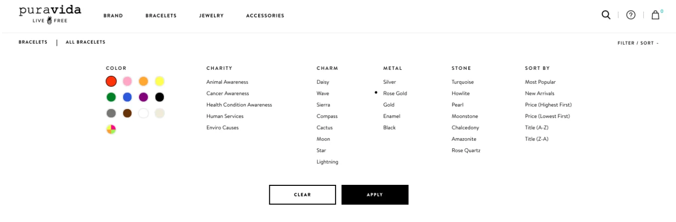
A bad example from the Puravida website:
The filters are hidden in the small “Filter/Sort” button, so you can only use the filters when you notice the small text at the top right of the page.

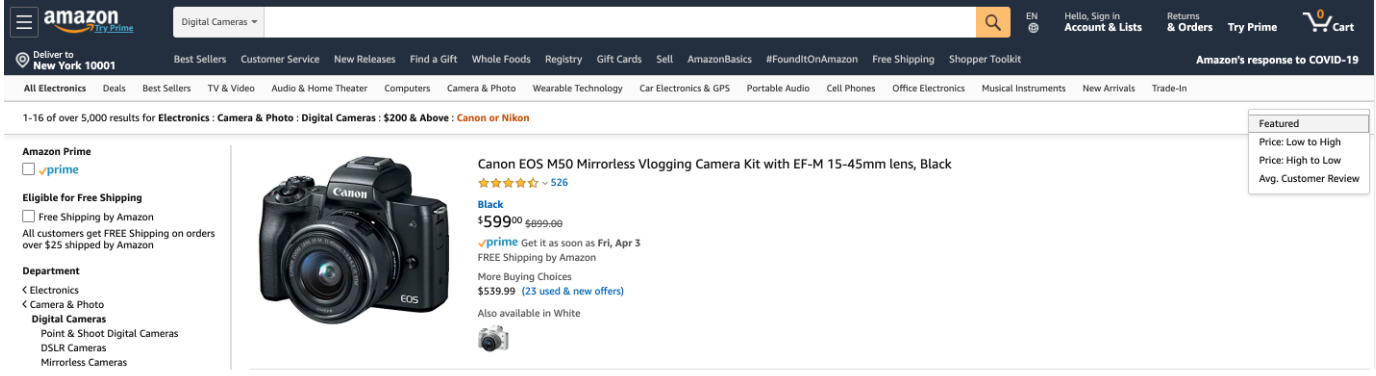
A good Example from Amazon:
The filters are visible above the fold, located on the left side of the page, and separated from the rest of the page content by a line.

Can products be filtered by category -specific variables like size, color etc.?
Many visitors of category pages are look for specific features such as size, color, price, brand, and so on.
Place these filters at the top of the page or in the sidebar.
ASOS displays an array of filters on category landing pages.

When adding information about colors or providing different color options, make sure to display images of the colors (small color blocks) instead of just describing them in text.
A good example from Adidas Website:
Adidas displays the available color variety well, using small color boxes, which greatly enhances the overall user experience on the category page.

Do you only show relevant filters for each category?
Various product categories require different filters, so make sure not to display irrelevant filters in different categories. If you sell different products, keep in mind that each product category has its own unique attributes. It’s unlikely that a filter will be applicable to all categories, so you need to manage them and determine which filters are most important for each category.
Two examples from Gymshark Website:
As an example, let’s take a look at Gymshark and how they set up different filters for different categories. For socks, available filters include color and size, which are relevant to the type of product.

For wallets, the only available filter includes color because size is not related to this type of product.

Have you included sub-category filters on your listing page?
Etsy has added this feature on all of its listing pages, including category pages and search results pages. This feature aids users in narrowing down their search. For instance, when searching for pillows, there are over 800,000 results! These subcategories help users in fine-tuning their search.

Are the most used filters placed at the top of all filters?
Some filters are probably used more than others, so it’s better to place them higher than others to make them easier and faster for users to find.
An example from Staples:
The order of displaying filters varies in different categories. For example, the “rating” filter is the second filter displayed in the “Notebooks” category and the third filter displayed in the “Binders” category.


Do you allow users to select a few filters at once?
In many cases, users need to apply multiple filters simultaneously, and this is logical since they are interested in viewing only those products that meet their specific requirements and preferences.
If users are unable to select different filters at the same time, they will be compelled to apply each filter separately, resulting in a much more complicated product search process.
For example, consider the scenario where you are selling sports shoes. The first filter that most users apply is size, as it is pointless to browse through shoes that are not available in their size. The next filter that users typically apply is color, as many individuals prefer a particular color that complements their other clothing. Finally, users tend to apply the maximum price filter to ensure that they remain within their budget.
If users can apply these filters simultaneously, all products that match the user’s needs will be displayed quickly, and the purchasing speed will increase significantly. If this option is not available, many points of friction will arise, and the user will be forced to perform many unnecessary actions.
A bad example from the Puravida website:
Users can only select one option in each filter, so they cannot see red and yellow bracelets at the same time. They need to first select the red color and then go back to the filter section to select the next color.
A bad example from the Gymshark website:
Each time, only one color can be selected, and by applying each filter, the other items are removed. Therefore, it is not possible to combine color and size filters.

A good example from the Smartwool website:
Multiple filters can be selected simultaneously to have the results of all desired features. The only issue is that the filter section does not have a good design.
Simultaneously selecting multiple filters allows users obtain results with all desired features. The only issue is that the filter section does not have a good design.

Do you auto-update product list when a filter is selected?
Avoid forcing users to perform unnecessary actions. After selecting each filter, apply it and update the results.
Otherwise, users will have to perform two actions every time they apply filters: click on the filter and then press the “Apply” button. If they want to apply multiple filters, they will have to repeat this process several times, which is pointless and results in a poor user experience.
Instead, offer the option of auto-updating after selecting each filter and eliminate all unnecessary actions in the purchasing process.
A bad example from the Mavi website:
Users are required to perform many unnecessary actions to apply each filter. Click on the dropdown list > select an option > click on the “Apply” button.

A good example from Decathlon website:
Filters are visible by default on the left-hand sidebar. By clicking on each option, it is automatically applied to the product list without the need for any unnecessary action.

How should we design the sorting menu?
Do you offer sorting on your website?
Some users need to sort products based on features such as price (low/high), highest rating, best sellers, and newest arrivals. This feature assists them find their desired products quickly, and that’s why having the sorting option on the PLP page is essential. This feature significantly improves the purchasing process for price-sensitive users (because they can sort products by price from expensive to affordable or vice versa). It also benefits users who rely heavily on customer reviews (as they can sort products by previous users’ ratings) and those who follow trends (because they can see the most trending, best-selling, or new items).
When adding the sorting feature to the PLP, do not overload this section by adding unnecessary options. Only add options that will be very helpful and effective for use
A bad example from the HasbtoPulse website:
A large number of sorting options are displayed, including Title: A-Z, Title: Z-A, Date: Old to New, and Total Reviews: Low to High. It does not seem that all of these options would be useful for every user.

A good example from the Amazon:
Amazon only promotes 4 very options that are very useful: Featured, Price: Low to High, Price: High to Low, Avg. Customer Review.

Do you have a comprehensive set of ascending/descending ranking options like price, popularity, relevance, and new arrivals?
Alongside filters, it is important to provide users with the ability to sort products based on a set of variables such as price, relevance, novelty, and so on.
This feature has two benefits:
- By diversifying the search experience, user engagement increases.
- It helps users who have specific features in mind for their desired product but find filters too specific and detailed.
A good example from Crutchfield:
Crutchfield website provides the ability to sort based on various options, such as price: low to high.

Do you show sorting feature on the top right corner above product list?
The logic behind this suggestion is similar to the suggestion of placing filters in the left sidebar, as users are accustomed to this and know where to find it, resulting in good usability.
However, if you place the sorting option in a location which is not standard, it will be more difficult for users to find, leading to weaker usability.
If there is no need to relocate the sorting option, keep it at the same place.
A bad example from the Puravida:
Displaying sorting and filtering options in a single window is not a standard UX solution and for this element and makes it harder to locate the sorting option.

A good example from FashionNova:
On the FashionNova website, the sorting feature is displayed where we expect it to be, at the top of the PLP and on the right-hand side of the page.

Conclusion:
In conclusion, by implementing well-designed CTAs, menu filters, and sorting filters on your PLP, you can improve CRO and drive better results. This concludes our series on enhancing the PLP experience. Stay tuned for our upcoming series on Product Detail Pages (PDP) where we will explore maximizing conversions at the individual product level. Thank you for following along, and we look forward to continuing this journey with you.