Welcome to our next installment in optimizing Product Detail Pages (PDP) for enhanced conversions. Today, we explore the profound impact of product images on driving engagement and boosting sales. Discover how visually compelling imagery showcases product details, builds trust, and sparks emotional connections. Building upon our previous discussions on PDP layout, titles, and descriptions, we now delve into the critical role of product images in delivering immersive and persuasive shopping experiences.
Do you have gallery with different product photos?
The photo gallery on the product page is one of the most important sections of the page. After the customer is attracted by the first photo, we should show them more photos so that they can make a more accurate and faster selection.
Here are guidelines for creating a standard photo gallery on the product page:
- The background of all photos should be the same as the first photo that the user has seen and been attracted to. This reduces cognitive load and enables customers to focus solely on the product.
- The photos should showcase the product from different angles to the customer.
- The photos should depict the product being used in everyday life so that customers can emotionally react and envision precisely how life with this product will be.
- There is no specific recommendation for the number of photos in the gallery. However, by adding more photos, you can help the customer visualize the product in their own life.
An example of how a product can be displayed in everyday life:

An example of showcasing a product in competition with other products:

An example of a product photo gallery with a consistent background:

Does product gallery has actionable elements to engage with it?
Two elements can help engage users on a product page. The first is the thumbnails in the product photo gallery, while the second is the left and right arrows next to the main product image.These arrows encourage users to interact with the product page.
With these arrows, users can easily navigate between the product gallery images. In fact, they can view more images of the product with the simplest of movements, thanks to these arrows.
An A/B test involving prominent arrows on the product photo gallery showed that user engagement with the product photo gallery increased by 68% with these arrows. Therefore, these arrows can be considered a call to action on the product page that invites users to engage more.
A good example from Gymshark:
The flashes on this website are prominently displayed on a dark background, which can engage users very well.

A bad example from the Puravida website:
Not only does this website lack any flashes that can engage the user, but the small dots at the bottom of the page are also not prominently displayed and do not cause any engagement.

Is the product shot large enough to see specific details?
On e-commerce websites, product images should be large enough for users to see all the details of the product. Online customers often have doubts about the products they are buying, so it is crucial that images are big enough to show all the details clearly. While it’s not necessary for product images to be as large as a billboard, they should be sizable enough to ensure that no details are hidden from the customer’s view.
Does product gallery show thumbnails of other available images?
Displaying thumbnail images in a product image gallery encourages users to browse through other images of the same product, increasing their engagement. The more engaged a user is, the easier it is to persuade them to buy a product.
If a customer can view all the images of a product (from different angles, colors, sizes, etc.) in one glance, they are more likely to purchase from your website compared to a customer who only sees one image of the product. Therefore, it is always recommended to use thumbnails instead of small dots in a product image gallery, which many e-commerce websites fail to do.
A good example from AmericanEagle website:
On this website, even thumbnail images are used on the mobile platform to display the type and color of clothing from various angles, providing complete clarity.

Does product gallery support swipe actions on Mobile devices?
It is interesting to note that nowadays, 80 to 90% of e-commerce users make purchases using mobile devices. Almost all popular mobile apps and websites provide the ability to swipe between images, including Facebook, Instagram, and others. Users typically use either the arrow or swipe to move between images in the gallery. Therefore, one of the essential features for e-commerce websites in their native mobile version is the ability to swipe in the product page image gallery. This feature allows users to have a better experience and convert into buyers more quickly.
To implement this feature, platforms such as Shopify app, which have the swipe feature in the product image gallery, can be utilized.
Does the enlarge photo function work properly?
One of the important functions of image galleries is the ability to zoom in on images. By zooming in on an image to see more details about its material, color, or other features, customers can gain more confidence about a product. Therefore, providing automatic zooming capability by hovering over images is very important.
A good example from Zappos Website:
A good example of zooming in image galleries is this product, which has a very suitable level of zooming, allowing users to see the complete details of the product up close. This experience makes it much easier and faster for users to become buyers.

Are photographs of a high-resolution and high quality?
In addition to having a sufficiently large size and zoom function, your image gallery should also pay attention to the quality of the images. The resolution quality of your images should be high enough to show the product image clearly to the user. Just as a user examines a product up close, display the product image with high quality (especially for products with many details and features).
Do you have enticing main image?
In the world of visual media, images can make or break an e-commerce website. If a product image fails to evoke any emotions in the user upon first glance, then the e-commerce site has already lost the game. Therefore, if the main product image has a low quality, or fails to display the product clearly or evoke any emotions in the user, it will directly negatively impact e-commerce conversion.
Guidelines for having an enticing main image are as follows:
- The product should be centered in the image.
- The entire product should be clearly visible in the image.
- The background should be white or light.
- There should be no confusing or unnecessary objects in the image.
- A professional image with good quality and lighting is needed.
Do product photos highlight the most important features for users (such as the soles of shoes)?
There are many products with intricate or large details that require completely suitable images with zooming capabilities and high resolution.
Additionally, we must show specific details of the product in the images to the users. For example, in a shoe image gallery, we should also show an image of the sole to the user. Similarly, in a laptop image gallery, there should be an image of the keyboard.
A good example from Zappos:

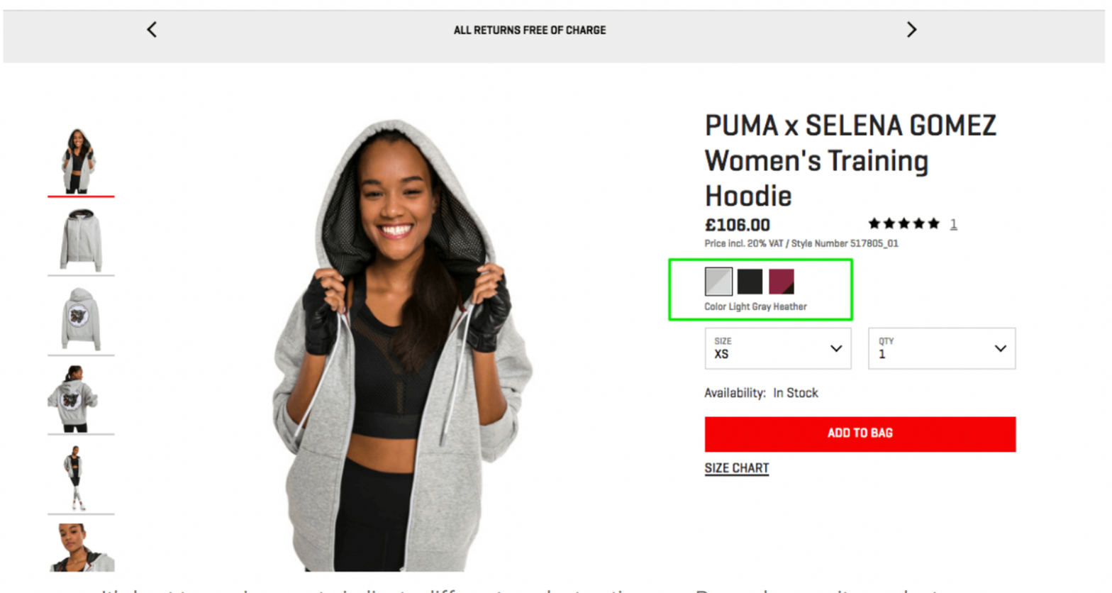
Is product variants selection integrated with product gallery and shows images of chosen product variant?
When a website offers a product with various types, it is essential to display a separate image for each type to the user. For instance, if the user chooses a different color, the website should display the same product with the selected color in the images. Otherwise, the user may ask, “How will this product variant appear?” which could create difficulties for them during the purchasing process.
Therefore, the website must have separate photos for all types of products. Then, each photo should be assigned to its corresponding option, so that selecting that option will display the related image. For instance, the Shopify platform has established this process entirely.

A good example from the Puravida website:
By selecting one product, Puravida website displays all color variants of the same product

For clothes retailers, do you include information about the model near to the photo?
In e-commerce for clothing, we should write the size and model of the garment next to its image. This provides the user with a more precise and improved visualization of the size and type of clothing and brings them closer to making a purchase.
It is important to remember that customers always want to make informed judgments quickly. They do not want to spend a lot of time searching for the product page and necessary information. By finding sufficient information in one place, customers gain enough confidence to proceed with their purchase.
A good example of sufficient information for clothing is:

In a nutshell:
In conclusion, optimizing product photos on PDPs is crucial for driving conversions and creating an engaging shopping experience. Craft compelling galleries with high-resolution images to captivate your audience. Implement visually appealing thumbnails and detailed photos to build trust and increase conversions. In our next article, we will explore product variants and important details to further enhance your PDPs. Stay tuned for insights on leveraging options, specifications, and unique selling points for maximum conversions. Elevate your e-commerce success with optimized PDPs.