The PDP page, or the product’s detail page, is one of the most crucial points for converting users into buyers. In the previous article, we discussed the availability or unavailability of the product, main CTAs, and delivery methods. In this fourth PDP article, we aim to provide insights about policies, recommendations, urgency elements, and customer reviews and ratings. By following the points mentioned in this article and the previous ones related to PDP, you can attain a standard version and increase the conversion rate of this page.
Policies:
Do you show information about returns, refunds and money back guarantee?
If users know that there is no risk involved in buying from you, they will find it much easier to complete their orders. If they know that they can easily obtain a refund, return, or exchange the purchased product, their fear of buying from your website will be greatly reduced.
That is why it is crucial to let users know that these options are available in your store. And by options, we do not just mean refunds or exchanges; you should emphasize any type of warranty associated with your product.
There are various types of warranties that can encourage users to make a purchase, such as:
- Refunds or replacements
- Product warranties
- Information about place of production (being produced in local factories is an advantage.)
- Information about product quality (3rd party reviews, badges, etc.)
- Quick support in case of any issues
- Availability of support through different channels (online chat, phone, email, etc.)
- Risk-free trials for products at any time interval.
A bad example from Momabikes:
They sell relatively expensive products but haven’t displayed any significant information about the warranty on the product page, which is crucial for this store. This is because the more expensive the product, the more hesitant customers are to buy. Although there is information about the warranty, production location, and method in the lower sections of the page, most users do not typically scroll down to that section.

A good example from the MVMT website:
They have dedicated a section to information about product warranties, secure checkout, and free returns.

Recommendations, Upsells, and Comparable Alternatives:
Do you have cross-sell or/and upsell sections (relevant for stores with many related / alternative items)?
In ecommerce stores, you can increase the Average Order Value (AOV) through up-selling and cross-selling. Up-selling involves encouraging customers to purchase a more expensive, updated, or higher-quality version of the chosen product. Cross-selling involves encouraging customers to purchase related or complementary products to the chosen product.
Overall, these strategies will have a positive impact on the conversion rate, as customers may not necessarily like the product they are currently viewing on the product page. These techniques help customers find their desired product, which can lead to increased satisfaction and higher sales.
There are different types of upselling and complementary sales strategies, which include:
- Displaying best-selling products or related products
- Offering bundle discounts with multiple products (a tactic frequently used by Amazon with its “Frequently Bought Together” section)
- Promoting other product collections
- Displaying products based on previous purchase history
- Showing related products (such as a pillow for a mattress)
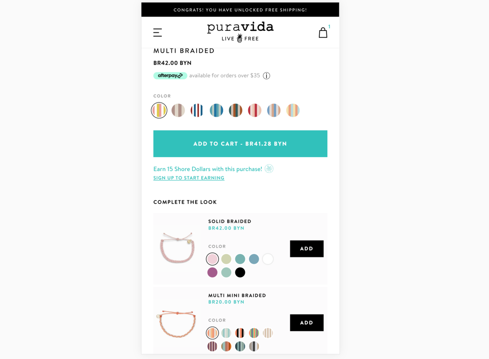
A good example from Puravida:
In the “Complete the Look” section located below the ATC button, you will find related products displayed. With just one click, you can easily select a color from this section and add the related products to your shopping cart.

An example from Gymshark:
We are currently on the leggings page, and it is suggested that we also purchase tops and shorts because these products are related and usually bought together. These recommendations are located below the product descriptions, using the phrase “You might also like”.

Sense of Scarcity and Urgency:
Do you use urgency elements? (Relevant for stores with discounts, special offers, next day shipping)
If you give customers time to think, they will delay their purchase. Sometimes this delay is short, but sometimes it can be long enough that the user even forgets about the product and offer.
An effective way to convince users to complete their purchase right now is to create a sense of urgency. If you have discounts or special offers, you can limit them in terms of time and let users know.
Here are some suggestions for creating a sense of urgency:
- Use countdown timers or inform users that the offers are time-limited and will soon end.
- Place elements that create urgency close to their relevant section. For example, if you have a countdown timer for a discount, place it close to the product price. Similarly, if you have a timer for same-day shipping, place it close to the shipping information.
- Avoid creating a fake or unrealistic sense of urgency for users, especially if you have a lot of returning users. Doing so can harm your business in the long run.
- Make these elements visually noticeable in terms of color and size to attract users’ attention and influence their purchasing decisions.
A good example from Amazon:
There is a 28% discount available on the product, which will end soon, and the timer notifies the user about it. Additionally, a countdown timer is displayed for sending the next day, which surely encourages users to make quicker decisions.

An example from the Nectar website:
An on-screen timer is displayed above the product image, ensuring that the user sees it and feels a sense of urgency to make a decision regarding the significant discount on the mattresses.

Do you use scarcity elements? (Relevant for stores with limited stock or limited offers)
If you have a limited quantity of a product or a special offer for buying a specific number of products, you should highlight these conditions on the product page. This creates a sense of scarcity and convinces users to act more quickly.
This technique is very powerful, and if used intelligently, it can definitely increase conversion rates and revenue.
There are different types of techniques that are suitable for different types of stores:
- Limited time offer: A product or price that is available for a specific period of time.
- Seasonal products: Products that are only available during a certain season, such as Starbucks’ flavored lattes.
- Seasonal offers: A temporary price reduction for seasonal products or entire product lines due to a season.
- Discount due to limited quantity: A limited quantity of a product is available for sale. These offers can apply to one or multiple products.
Suggestions:
Arrange the elements that indicate scarcity near the relevant section, like the price or CTA button.
Highlight them significantly by using colors and different sizes to grab users’ attention.
Highlight the types of products (colors and sizes) that are unavailable, indicating high demand for those products.
Avoid creating a false sense of scarcity, especially if you have many returning users. Doing so, may adversely affect your business in the long term.
A good example from Walmart:
The phrase “Only 2 left” is displayed near the price and creates a sense of urgency, encouraging users to make a purchase right now.

An example from Nectar:
They indicate the “Low in stock” standard text in red in the ATC area. This condition is not as effective as the previous example from Walmart, but it is better than not showing anything.

A smart example on the Amazon website:
Please pay attention to the “Lightning deal” section, where the item “84% claimed” intelligently creates a sense of scarcity.

Customer ratings, reviews, and QA:
Do you show customer reviews and the overall ratings on top of the page?
User reviews play an important role in e-commerce products because many users rely on the opinions and reviews of other buyers to make purchasing decisions. Therefore, it is essential to allocate a separate section for reviews so that potential customers can read the opinions of previous customers.
Amazon is an excellent example of this because they have dedicated a significant amount of time and effort to develop one of the most powerful review systems, and they firmly believe that reviews can persuade users to make a purchase.
Principles for User Reviews:
- Actively ask previous customers to provide feedback.
- Encourage users to write reviews by offering discounts or free gifts. (If they don’t write reviews without these offers.)
- Obtain specific information about the user and purchase and add it to the review as much as possible. The more information there is, the more reliable it will be. (Username, product features, a real photo of the product, time of purchase, whether the review is verified or not, location, etc.)
- Depending on the complexity of the products, place user reviews above or below the product description. (For more complex products, reviews are more important than descriptions.)
- Display the total number of reviews to increase credibility.
- Display the user’s overall rating for the product.
A good example from Amazon:
Amazon has the most powerful review engine and utilizes it to motivate users.
- Reviews accompanied by photos are given priority.
- The percentage breakdown of various rating scores is displayed,
- Significant information is provided about the reviewer, such as the date of purchase, the country of origin, the purchased product, and its features.

A good example from the KKBeauty:
On KKBeauty website, they sell cosmetic products. In the beginning of the review, the username of the user is mentioned, and it is stated that they are a verified customer. Additionally, the age, skin type, skin color, eye color (which are important for this type of product), and the date of the review are also mentioned. This information makes the review more reliable and convincing for other users.

Do you show product ratings based on customer reviews on the top part of the page?
If you have previously requested users to rate a product, it is recommended that you highlight this type of social proof in the top section of the product page. Usually, the rating is placed close to the product name or somewhere in the upper sections of the page.
By doing so, users can easily see that the product has been purchased before and has received a high rating. While some users may be persuaded to buy the product based on the rating alone, others may use the rating as a means to navigate to the reviews section and carefully read each review.
Suggestions for displaying ratings:
- The standard location to display this element is somewhere near the name of the product (next to or below it). However, it would be better to find a place near the ATC button so that users can see it when they are deciding whether to proceed to the next step in the purchase funnel.
- Make sure to also display the number of reviews to create more trust.
- It is better to use standard gold or yellow colors for this element that users are accustomed to.
- Make sure that if a user clicks on the rating, they are directed to the specific reviews section.
- Ensure that the text indicating the number of ratings is underlined so that users know it is clickable.
A good example from the Alo Yoga:
The standard color yellow has been used for the score, which is great because it is placed exactly next to the price and the ATC button. This way, another advantage of this product is mentioned in this section, convincing the user to add it to their shopping cart.

Do you show any relevant social proof about your products or company?
Users heavily rely on social proof when making online purchases. Although reviews are the most popular form of social proof, there are other effective types that you can display on your product page to encourage users to make a purchase.
Here is a list of different types of social proof:
- Ratings from external review platforms, such as Trustpilot, which are generally trustworthy for users since businesses cannot manipulate the ratings.
- Product-related certifications: For instance, if you sell products for children, having FDA approval will provide you with a lot of credibility.
- News outlets that have featured you.
- Awards.
If you have won any awards for your product or business, mention them.
- Feedback from influential people (expert opinions)
- For example, if you are selling health products, make sure to highlight reviews from influential doctors. This way, you give users more validation that they need to go from “maybe I need it” to “I must have it.”
- User-generated content (UGC)
- We will talk about this in more detail in the next section.
- Endorsements from influencers
- Number of followers on social networks
Example from Qualockcase website:
For example, Qualockcase displays the number of its followers on Instagram and some user-generated content (UGC) images with its products.

In Prepdeck, the news outlets that have talked about this product have been mentioned.

The awards received from specialized websites in this field are displayed on nectarsleep.

Another type of social validation is highlighting the benefits of using the product that users have mentioned in surveys.
An example from the nectarsleep:

Do you include user-generated content, such as from Instagram?
User-generated content, such as Instagram posts and rich-media reviews (which include professional photos, images, and other enticing elements), is a powerful social endorsement that creates a lot of credibility. When displayed on your product page, it encourages user participation and strengthens the impact of positive reviews.
A good example from Vanity Planet:
On Vanity Planet website, their product page features user-generated content from Instagram. These images help users gain a valid perspective on the product and imagine themselves using it.

Conclusion:
In conclusion, this wraps up our series on optimizing the Product Detail Page (PDP). By incorporating return warranties, upselling, urgency, and customer reviews, we can create an engaging and reliable PDP that boosts conversions. Stay tuned for our upcoming articles on improving the Cart Page for further enhancements in the e-commerce experience.