In the world of e-commerce, the success of your online store heavily relies on your ability to convert visitors into paying customers. Conversion Rate Optimization (CRO) plays a pivotal role in achieving this goal, as it focuses on improving the percentage of website visitors who take the desired actions, such as making a purchase.
In our ongoing series of articles, we have explored various aspects of CRO, including optimizing the product page, cart page, checkout page, and more. In this installment, we shift our attention to the critical element that ties it all together: navigation.
The navigation design of your e-commerce website has a profound impact on user experience, customer engagement, and ultimately, your conversion rates. In this article, we will delve into the significance of navigation in CRO and provide valuable insights on how to optimize it for maximum impact.
Prominent and Consistent Navigation Menu
Introduction: A prominent and consistent navigation menu is a key factor in optimizing the conversion rate of e-commerce websites, facilitating seamless user navigation and enhancing the overall shopping experience.
Elements:
a. Clear and Visible Placement
b. Intuitive Labeling and Categorization
c. Consistency across Pages
Solutions and suggestions:
Do you have a prominent navigation menu to guide users to the next step of the funnel?
Having a prominent navigation menu is crucial for enhancing the conversion rate optimization (CRO) of e-commerce websites. A well-designed navigation menu serves as a reliable guide, leading users seamlessly through the various stages of their shopping journey.
By prominently displaying the menu, preferably at the top of the page, visitors can easily locate and access the essential sections of the website.
Steps for an effective navigation menu include:
- Using clear and concise labels
- Organizing categories logically
- Employing intuitive icons or dropdown menus
Additionally, incorporating search functionality within the menu can further expedite user navigation. By providing users with a clear path to follow, a prominent navigation menu enhances user experience, reduces friction, and ultimately improves the chances of conversions and successful transactions.
A good example from Target Website:
Target prominently displayed navigation menu at the top of the page allows for easy access and includes categories like “Categories,” “Deals,” and “What’s New,” while maintaining consistency across all pages and offering dropdown menus for further exploration.


Is the navigation menu prominently displayed on all pages of the website?
Best practices of displaying navigation menu prominently on all pages dictate that the navigation menu should be placed in a prominent position, such as the top of the page or in a fixed position as users scroll.
By maintaining consistent visibility, users can easily access the menu regardless of their location within the site, leading to a seamless browsing experience.
This approach leads to some benefits:
- It ensures that visitors can quickly and intuitively navigate between different sections, product categories, search functionality, and their shopping cart.
- Prominently displaying navigation menu on all pages, also helps users easily find what they’re looking for, reducing frustration and encouraging them to explore further.
This consistency and accessibility not only improve user experience but also contribute to higher engagement and conversion rates, ultimately driving the success of e-commerce websites.
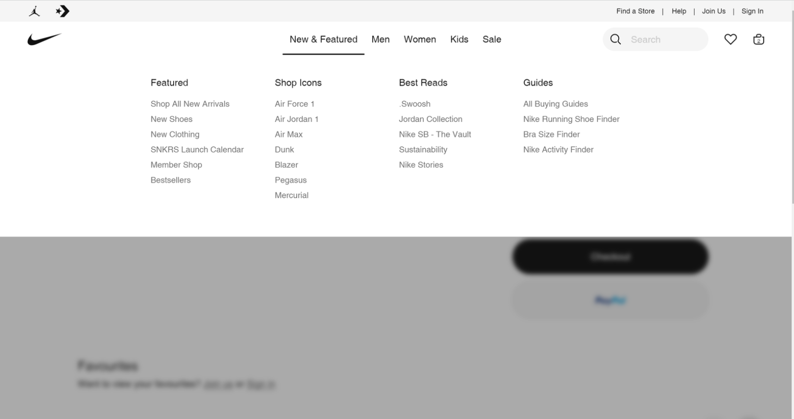
A good example from Nike Website:
One excellent example of a prominently displayed navigation menu can be seen on the e-commerce website of Nike. Users are greeted with a large, well-defined navigation menu situated at the top of the page, and they have access to this menu in all pages of the website.

Are the navigation labels clear and descriptive, guiding users to relevant sections or pages?
Clear navigation labels in e-commerce websites optimize conversions by guiding users, reducing confusion, and improving engagement. They align with users’ interests, enhance the user experience, and boost conversion rates.
The following practices aid in achieving clear and descriptive navigation labels:
- Use brief and easily understandable labels that accurately represent the content or category they lead to.
- Put yourself in the shoes of the users and consider their perspective.
- Perform usability testing to gather feedback from real users.
- If your industry has commonly used terms or phrases, incorporate them into the navigation labels to enhance clarity.
- Organize navigation labels into logical groups that reflect the website’s structure or content hierarchy.
- If your website has subcategories or subpages within a section, use descriptive submenus or dropdown menus to provide more specific navigation options.
A good example from Etsy Website:
When visiting Etsy, users are greeted with a prominent navigation menu at the top of the page. The labels used in the menu, such as “Home Decor” “Outdoor & Gardening” and “Kitchen & Dining,” are concise and descriptive, immediately indicating the relevant sections users can explore.

Does the logo on the website link to the home page?
The presence of a logo on an e-commerce website that links to the home page holds immense importance in providing a consistent and intuitive means for users to navigate back to the main hub of the site, ensuring easy access to essential information and functionalities.Additionally, this simple yet effective practice can instill a sense of trust and credibility in users, as it is a widely recognized convention in website design.
A good example from Columbia Website:
By clicking on the Columbia logo located in the top left corner of the page instantly users will be redirected back to the home page. This consistent functionality allows users to easily navigate to the main hub of the website, regardless of the page they are currently on.


Conclusion:
To wrap up, a prominent and consistent navigation menu is essential for optimizing the conversion rate of e-commerce websites. By providing clear navigation labels, prominently displaying the menu on all pages, and ensuring the logo links to the home page, businesses can enhance user experience and guide users effectively. However, the journey to better conversion rate optimization doesn’t end here. In our next article, we will explore the significance of a clear and intuitive category structure. We will delve into organizing products and sections in a logical and user-friendly manner, helping visitors easily find what they’re looking for.