In the next installment of our PDP series, we explore the crucial aspects of price and payment options for Conversion Rate Optimization (CRO) on your Product Detail Pages. In this article, we will delve into effective strategies to make prices and extra charges prominent, offer convenient payment options, and provide important notes for a seamless shopping experience. Get ready to optimize your PDPs, drive conversions, and maximize your e-commerce success.
Price & payment options:
Is price of a product visually prominent?
For many customers, the price of a product is the first thing they consider when deciding whether or not to buy it. If a customer cannot easily find the price on the product page, they will definitely buy from somewhere else. Additionally, if a discount has been applied to the product price, the importance of displaying it prominently is multiplied several times.
To display the price on the product page effectively, use the following guidelines:
- Use high-contrast colors to make the price stand out from other information.
- Use a larger font size to display the price, even if it is only 2-4 pixels larger, as it will be more distinguishable from other text.
- Use white space around the product price to separate it from other information on the page.
- Use a bold font to make the price completely prominent.
- Align the price to the left side of the page (especially on mobile) to improve scannability.
A good example from the West & Willow:
All the above cases, including large font size, white space, and bold font for displaying price have been observed in the following image.

Do you show all additional charges near price?
If there are any additional costs associated with a product, such as moving large items or shipping to distant locations, it is better to inform the customer beforehand rather than surprising them with these costs at the checkout page. However, the additional details are not limited to just costs. Customers also want to read about delivery, product returns, warranties, and other necessary information on the product page. Some customers may even decide not to make a purchase after reading this information. The worst-case scenario is when customers face a sudden increase in price due to additional details at the final moment of the purchase.
A good example from the Worldmarket:

Is the price of a product placed near the CTA-button?
When users are ready to proceed to the next step of purchasing, which involves adding a product to the cart, they should be able to clearly see the product price without the need for any unnecessary actions. It is, therefore, crucial that the product price be located near the CTA button so that it is always visible on one screen. This is especially important on mobile devices, where the screen is smaller than that of desktops and tablets, but mobile users are currently the dominant traffic.
If the price is far from the CTA button, it creates friction in the purchasing process because users have to scroll back and forth to find out the price. Therefore, the main rule to follow is to ensure that users can view important information without any unnecessary movement. It is important to place the price close to the CTA button.
َ A bad example on Abbotlyon:
There is much content between the price and ATC button, and as a result, both are not visible on the same screen, which creates confusion for some users.

A good example on Cupshe Website:
The price and ATC button are located on the same screen, so if a user wants to add this product to their cart, they have all the necessary information in front of them. Also, the price is highlighted and placed on the ATC button.

A good example from Redbull:
The price section is positioned prominently just above the ATC button, ensuring that users won’t overlook this essential information.

Do you show how much shoppers save if you have products on sale?
If you are putting items on sale, it is essential to be transparent about the final price and the discount. It would be better to display the amount of money and the percentage that customers save with this discount. Without this information, customers will have to do the calculations themselves, creating an additional cognitive burden that is not ideal. Instead, provide your users with calculated information and illustrate the value of the discount.
Furthermore, it is crucial to give priority to this information visually because discounts are one of the most significant factors that encourage users to make purchases.
If you fail to communicate the information effectively regarding the discounts, many potential users may not notice or pay attention to them.
A bad example from Sunday Somewhere:
This website only displays the original and discounted prices, without indicating the amount that is saved.

A good example from Etsy:
This website clearly indicates that “You save USD 2.20”, and this price reflects a 20% discount off the original price. As a customer, there is no need for us to calculate anything, as we can clearly see the benefits of this discount, which will expire in 21 hours.

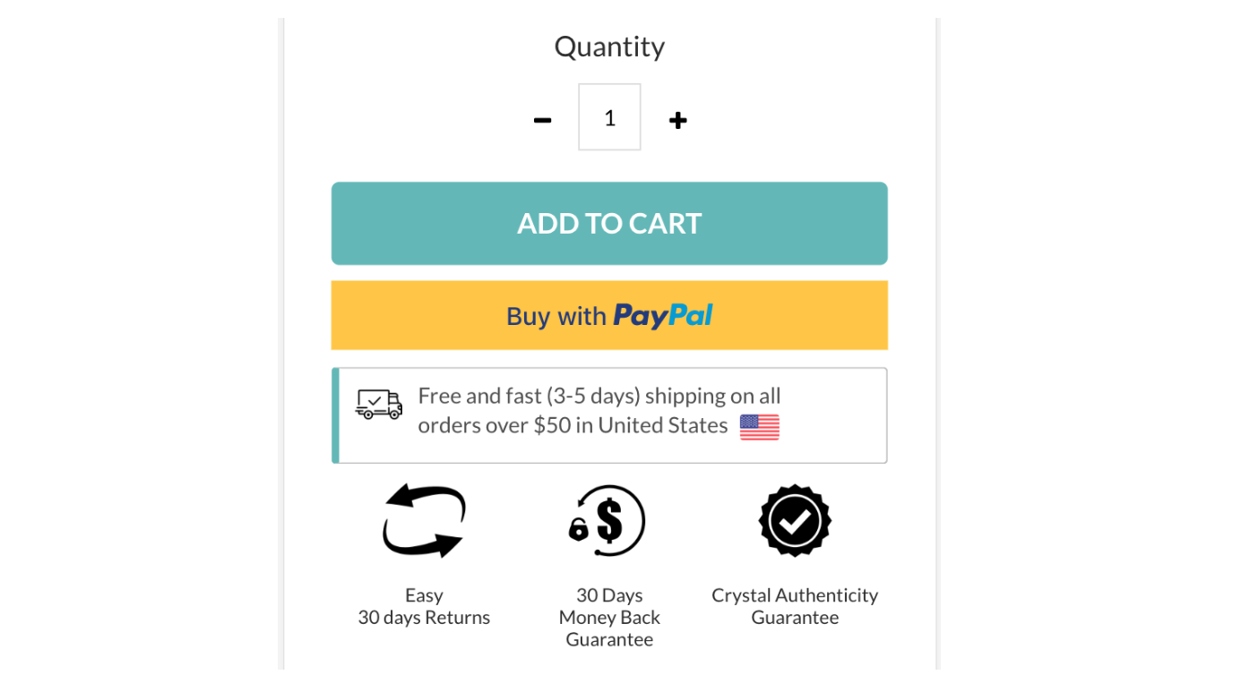
Do you show express payment options that are widely-used by your target audience?
In the past year, customers have become accustomed to a new type of button when choosing and making final purchases of products on e-commerce websites. Express payment buttons, such as PayPal, Amazon Pay, Google Pay, and Apple Pay, offer simpler ways for customers to make purchases. In fact, creating such buttons is also beneficial for e-commerce websites because it makes the purchasing process faster and simpler, and users become customers more quickly. Additionally, having such buttons increases customers’ trust in your website.
This button is usually located below the main Call-to-Action (CTA) button, which is typically “Add to Cart” on a product page or “Checkout” on a checkout page. However, when it comes to using these buttons, you should be careful. If you offer all these options to the user at once (for example, providing them with four payment methods), it may be difficult for them to choose, which could negatively impact your sales process. Therefore, with a little research, you can find out which payment gateways people typically use to buy products in the geographic area where your e-commerce store operates and use those same gateways on your payment page.
In conclusion, having express payment buttons on your product page is necessary, but it depends entirely on the geographical area and the type of product you are selling.
A good example from Shopify:
When we log in to Paypal via the browser and open Shopify, we notice the “Buy with PayPal” button that speeds up the purchase process. Upon clicking this button, the checkout page appears with pre-filled fields containing PayPal information, allowing for a swift purchasing process.

Do you provide installments payments and promote it well?
Nowadays, one of the competitive advantages seen on e-commerce websites is the option for installment sales, especially for stores that offer medium to high-priced products. This option helps customers purchase expensive products more quickly and pay for them in installments at a later time. Therefore, it is important to display the number of installments and the amount of each installment in a clear and straightforward manner to help customers make a quicker decision. The best place to provide this information is on the product page. You can prominently display the price of the product on the page, along with the installment payment terms within the same price range.
Recommendations for promoting Installment Payments in E-commerce stores:
The optimal approach is to display the installment terms alongside the original product price. The most relevant place to showcase this element is on the product page.
You can display the installment terms in the pricing section of the product page or near the total price on the cart page. Therefore, users should be informed about the installment terms before reaching the checkout page.
If you have a dedicated section for the main benefits of buying from your store (such as free shipping, etc.), you should also include the terms of installment sales. It is considered a significant advantage, and users need to be aware of it.
You can also include information about installment sales in the message bar at the top.
If your installment terms are only available in certain countries (e.g., only for employees in the United States), make sure to display these terms only to those individuals and not to users in other regions.
A good example from the Leesa website:
Leesa is selling relatively expensive products (starting from £369). Therefore, it has offered installment sales (with DivideBuy) with very favorable terms (you only have to pay £31 per month). Users who choose to buy through installment sales may never convert if these conditions are not available.

To sum up:
Optimizing the price and payment options on your Product Detail Pages (PDP) is crucial for driving conversions and creating a seamless shopping experience. By making prices and extra charges prominent, offering convenient payment options, and providing important notes, you can instill confidence in your customers and guide them towards confident purchasing decisions. In our upcoming articles, we will continue our exploration of PDP optimization, delving into other key aspects such as product reviews, upsell, alternative products, etc.