We can say that the cart page is a turning point in conversion rate optimization (CRO) because it is the final stage in the user journey before they make a purchase. If users encounter issues or difficulties on the cart page, they are more likely to abandon their purchase, resulting in a lower conversion rate. Therefore, optimizing the cart page is crucial to improve the overall conversion rate and increase revenue.
In this series of articles, We will explore various aspects of a successful cart page and provide actionable tips and examples to improve your online store’s CRO.
In this article (the first cart page article), we tried to collect and present the points related to the first and second titles, Data Points Indicating Users Struggle with the Cart Page and user-friendly design of the cart page . In the checklist below, you can see all the important sections of this article at a glance and continue reading:
What are the data and user behaviors that indicate the need for improving the cart page experience and CRO?
Here are some qualitative and quantitative data points and user behaviors that can indicate the need to work on the cart page experience and CRO:
- Qualitative data points:
- User feedback and complaints about the cart page experience, such as difficulty navigating the page, unclear pricing, or confusing checkout process.
- User testing sessions revealing confusion, frustration, or high abandonment rates during the cart page experience.
- Analysis of customer service inquiries related to the cart page, such as questions about shipping, returns, or payment options.
- Quantitative data points:
- High cart abandonment rate compared to industry benchmarks.
- Low conversion rates from cart to checkout compared to industry benchmarks.
- Low average order value compared to industry benchmarks.
- High bounce rate on the cart page compared to other pages on the site.
- Long load times or high page speed metrics on the cart page.
- User behaviors:
- Users adding items to their cart but not proceeding to checkout.
- Users repeatedly adding and removing items from their cart without completing the purchase.
- Users spending a long time on the cart page without proceeding to checkout.
- Users abandoning the cart page after encountering an error or technical issue.
Examples of tools and platforms that can help track these data points and user behaviors include Google Analytics, Hotjar, Crazy Egg, and Optimizely.
User-friendly Design:
Make the page visually appealing and easy to navigate, with a clear call to action to complete the purchase.
Elements:
- Visual appeal
- ease of navigation
- clear call to action
- cart icon in the general navigation
Solutions and Suggestions:
Does your Cart Page have a clean and uncluttered design?
A simple design with minimal distractions can help shoppers focus on the products in their cart and make informed decisions without unnecessary cognitive load. Cluttered designs can cause confusion and frustration, leading to cart abandonment and lower conversion rates.
- Minimalist design with plenty of white space
- Clear and concise product information, including images, title, variant, quantity, and price
- Prominent and easy-to-use checkout button or call to action
- Simple and intuitive navigation, including breadcrumbs or a progress bar
- Limited distractions or irrelevant information, such as ads or unrelated product suggestions
- mobile- optimized: The cart page should be optimized for mobile devices, with a responsive design that adjusts to different screen sizes.
A good example from Warby Parker:
They have a simple, minimalist design with a clear call-to-action button, and only essential information is displayed.

Is the subtotal price placed near the main CTA button?
This can help to increase conversions by providing shoppers with a clear and prominent reminder of the total cost of their order before they proceed to checkout. This can reduce the likelihood of shoppers being surprised or deterred by unexpected costs further down the checkout process, which can result in abandoned carts. Therefore, it’s important to ensure that the subtotal price is clearly visible and located in close proximity to the main CTA button on the cart page.
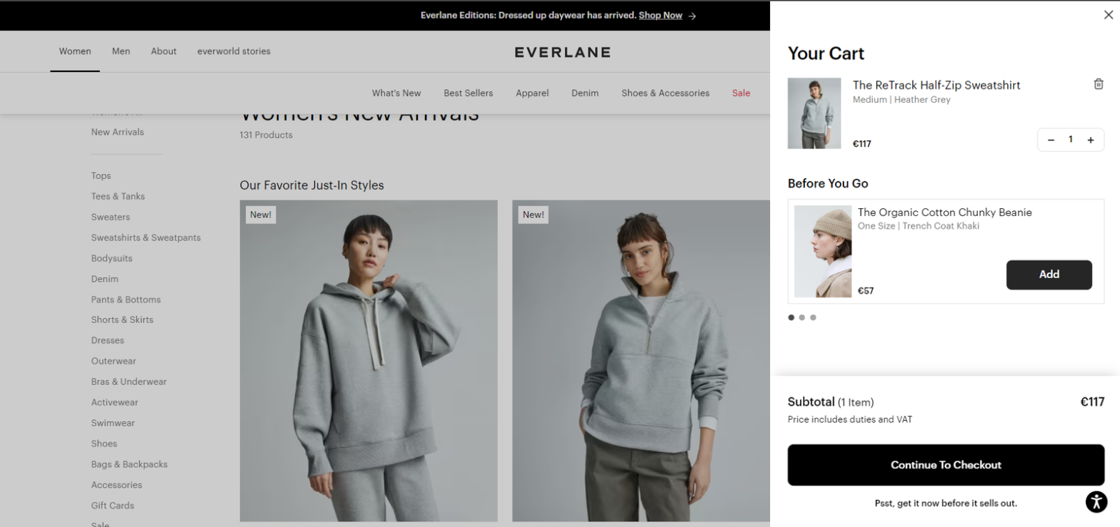
A good example from Everlane:
In Everlane website, the subtotal is prominently displayed just above the “Check out” button.

Does the copy of the main CTA-button clearly explain what will happen when you click on it?
A clear and concise call-to-action (CTA) copy on the main button of the cart page can help users understand what action they are taking and encourage them to complete the purchase. The copy should be informative and action-oriented, clearly conveying what will happen when the user clicks the button. For example, instead of using generic phrases like “Continue” or “Checkout”, the CTA copy can be more specific and descriptive, such as “Proceed to Checkout”, “Buy Now”, or “Place Order”.
It’s important to test different variations of CTA copy to see which one resonates best with your audience and leads to higher conversion rates.
A good example from Etsy website:
The main CTA button on Etsy’s cart page reads “Proceed to checkout,” which clearly indicates that clicking it will take the user to the checkout page to complete their purchase.

Do you have the “Continue Shopping” button on the Cart Page?
If you have just one or a few products in your store, it’s best to get rid of the “continue shopping” button altogether. This button can be distracting and not provide any value to your customers or your business.
However, if you have many products available and customers may benefit from browsing and adding additional items to their cart, it’s a good idea to add a “continue shopping” button to your cart page.
Keep in mind that this is a secondary action and will only be used by a small portion of your customers. It’s important to make it easy to find but not too prominent. Ideally, it should be a clickable text link (as shown in the examples below).
Direct customers to a page where it’s easy to start shopping for other products. This could be a collection featuring your best-selling products or products that complement what the customer has already added to their cart.
A good example from Hauser store:

Conclusion:
In conclusion, by analyzing the cart page data we can see that users face some challenges in completing their purchases. However, by focusing on user-friendly design, we can significantly improve the user experience and increase conversion rates.
In the next article, we will delve into the importance of clear product information and availability and delivery options, which are essential components of a successful cart page. So stay tuned for our next article and learn how you can optimize your cart page to enhance the shopping experience for your customers.