This series of article will focus on the Conversion Rate Optimization (CRO) of checkout pages on e-commerce websites, and it aims to provide various strategies and best practices to help online retailers optimize their checkout pages for conversions and increase sales and revenue. The first article will highlight the importance of clarity in the checkout process and will discuss key elements such as minimizing distractions, providing clear instructions, and optimizing the layout and design of the checkout page. The strategies provided in the series aim to ensure a user-friendly checkout process, leading to higher conversion rates and increased revenue for e-commerce websites.
The clarity of the checkout process is crucial for online shopping as it can determine whether a customer completes a purchase or leaves the shopping cart abandoned.
Elements:
- Clear and concise instructions throughout the checkout process
- A prominent and easy-to-find checkout button or link
Solutions and suggestions:
Is the main CTA clearly visible and does it stand out from other secondary CTAs?
To optimize the checkout page of an e-commerce website, it’s important to ensure that the main call-to-action (CTA) is prominently displayed and visually stands out from other secondary CTAs in order to make it easy for customers to find and complete the main CTA. This can be achieved through the use of contrasting colors, bold fonts, and other visual cues. On mobile devices, a screen-width button is optimal. It’s also important to minimize distractions on the page and avoid cluttering it with too many competing CTAs. Primary CTAs should always be more prominent than secondary CTAs.
A good example from Allbirds.com:
The checkout page of allbird.com, which sells comfortable shoes, is well-designed with a clear and prominent main CTA, “Continue To Shipping,” which stands with a high contrast. The checkout page has a clean and simple layout that minimizes distractions.

Is the next action button the most prominent feature on the checkout page?
The prominence of the next action button is an essential factor to optimize the conversion rate of an e-commerce website’s checkout page. The button should be easy to find and stand out, labeled “Continue,” “Next,” or “Proceed to Checkout,” leading to the next step of the process. This can be achieved through bold fonts, contrasting colors, and visual cues that draw attention. It should not compete with other elements on the page and be distinguished from secondary CTAs.
A good example from Nike:
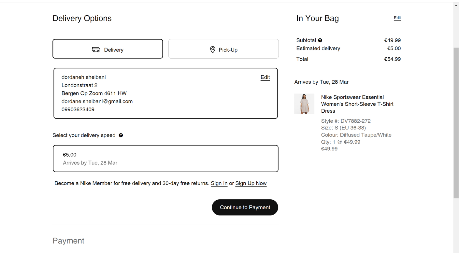
Nike’s checkout page has a clear and prominent “Continue to Payment” button that stands out from the rest of the page. The button is positioned at the bottom of the page, making it easy for customers to find and access. Additionally, the checkout page has a simple and clean layout that minimizes distractions, allowing customers to focus on completing their purchase.

A bad example from AED:
The checkout page of AED has several CTAs that look similar, making it difficult for customers to determine which button to click. The main CTA is not prominent, and may lead to cart abandonment.

Is the label of the main CTA on every checkout step descriptive, for example, “Buy Now.”?
The main CTA button on every checkout step of an e-commerce websites, should be descriptive and clear, providing a strong indication of what will happen when the user clicks on it. For example, using a label like “Buy Now” is a good practice as it is specific and indicative of the action that the user is taking. Using unclear labels like “Continue” or “Next” can create confusion, leading to a lower conversion rate.
A good example from the ASOS Website:
ASOS’s checkout page has a main CTA button labeled “Buy Now” that communicates to the user that they are passing a concise payment and checkout process, reduces any anxiety or hesitation that they may have about the checkout process, and creates a sense of urgency to encourage them to complete the checkout process.

A bad example from the Zara’s Website:
The main CTA button on Zara’s checkout page is labeled “Continue,” which is not very descriptive and does not give a clear indication of what action the user is taking.

Conclusion:
In a nutshell, ensuring clarity in your checkout page is essential to prevent customers from abandoning their carts and losing potential sales. In addition to the tips we shared in part one, part two of this article emphasizes the importance of including a progress bar, checkout FAQs, and simplifying the header and navigation. By implementing these additional features, you can further streamline the checkout process, reduce confusion and frustration, and ultimately increase conversion rates. Remember, a clear and user-friendly checkout page is key to a successful e-commerce business.
