According to various studies conducted on the homepage, users who use the search box are three times more likely to make a purchase from your website.
The homepage serves as a landing page for users to enter your website and may include a product suggestion box, product categories, a menu, and a search bar. Some customers already know what they are looking for, and if the design and functionality of the search box on the home page are correct, the user can quickly find and purchase their desired item from among thousands of products. This is why on large e-commerce websites such as Amazon, you see a prominent search bar on the homepage. Below is a checklist of items related to the display and design of the search bar, search intelligence, and search result improvement.
Different aspects of a search bar that should be considered:
Design:
- Prominent search bar
- An attractive and guiding place holder
- Having a search bar on all pages of the website
Smart search optimization:
- Auto-complete feature
- Product suggestion
- Displaying product filters/categories
Search results:
- Displaying product details
- Writing UX copy correctly in the ‘no result’ state
- Showing related searches on No Result pages
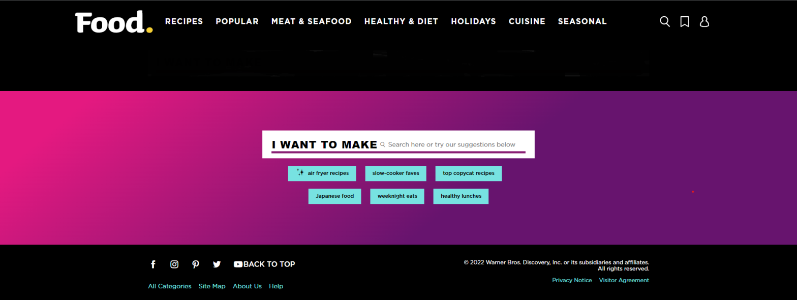
How should I design a prominent search bar?
Use prominent borders and a large size (proportional to the page), in order to place the search bar effectively within the user’s view on both desktop and mobile screens.
A good example from Amazon Website:
On the Amazon website, the search bar is located in the middle and at the top of the page with a clear design, on both desktop and mobile devices. This ensures that users who are looking for a specific product can easily locate and utilize it.


2- Write a captivating placeholder or title for the user, incorporating specific keywords to aid their search. For instance, try “What can we help you find?” or “Discover our vast selection of phones, laptops, and headphones.
A good example:
On the website below, by writing an attractive and informative placeholder text, the user is encouraged and guided to use the search bar.

The text used in Walmart’s website gives the helpful information that you can use the search to find items that are available either online or in the actual store.

3- Please note that on e-commerce websites, the clarity of the search bar on the homepage is important, but there should also be a search bar on all other pages.
A good example from Amazon:
On Amazon’s website, in addition to having a search bar on the homepage, it is also located on the PLP (product listing page) and PDP (product details page). This means that if a user wants to search for a different product, they do not have to navigate back to the homepage.


How can I optimize the search bar?
- By adding the autocomplete feature, you can assist the user in having a more accurate search.
- Display suggestions based on the word or phrase that the user has typed, under the search bar. For example, if they type ‘lap,’ show them top-selling laptops or related products to make their selection easier and faster.
Example from Puravida Website:
The website below incorporates both of the aforementioned features. By typing a few letters of a word, the autocomplete feature suggests the desired word for the user and displays related products.

3- On websites with a large number of products and diverse categories, one way to simplify the user experience with the search bar is to suggest general product categories related to the typed keyword or potential filters. By implementing this approach, we create an intelligent search bar that guides the user towards relevant categories or product listing pages (PLPs).
Example from Amazon:
When searching for “computer” on the Amazon website, users are presented with the image below. In addition to the autocomplete feature, computer product filters are displayed based on the user’s screen.

How can I optimize the search bar results?
1- To enhance the user’s search experience, it is recommended to display the product name, image, and significant features in the search results. This can help the user quickly identify relevant products and make the search process more efficient.
Example from Breadbrand:
On the Beardbrand website, displaying the image, name, and price of search results helps the user choose the most relevant results.

In addition to the picture and price, the main flavors that make up each blend are listed on this coffee selling website.

If a user searches for a word and no results are found, meaning that they are in an empty state, we should provide them with proper UX writing to guide them. For example, we could suggest “Try again with another keyword” or “Try using the navigation to find what you’re looking for”.
Example from Amazon:
On the Amazon website, when a meaningless word is searched, the result is displayed in the image below, which guides the user in two steps. First, it recommends that the user double-check or complete the spelling of the searched word. Second, it directs the user to the Help Center.
If the user is logged in, the advanced search system is used to guess the desired item.

On the search results page, when the desired item is not found, we can display to the user a list of items that have been searched using similar keywords or letters to assist them in correcting any typing mistakes.
Example from Asos:
On the asos website, the phrase that the user has searched for and the similar phrases that have been found in the search results are displayed to the user.

To sum up:
A search bar can quickly lead the user to the desired product. Additionally, when looking for a completely different product on PLP or PDP pages, the user can use the search bar and switch to other categories. Therefore, a clear and helpful search bar is one of the most important features of your website.