As an e-commerce website owner seeking to optimize your conversion rate, paying attention to every aspect of user experience is essential. In our previous article, we explored the importance of search functionality in enhancing navigation and helping users find specific products or content quickly. Now, we shift our focus to another critical aspect: visual cues and indicators.
Visual cues have the power to guide users, draw attention to important elements, and create an intuitive browsing experience. By incorporating effective visual cues and indicators, you can further improve your website’s navigation, engagement, and overall conversion rate. In this article, we will delve into the significance of visual cues and indicators, along with best practices to implement them effectively.
Visual Cues and Indicators
Introduction: Enhancing your website’s navigation through visual cues and indicators can significantly boost your conversion rate, providing users with clear guidance and improving their engagement.
Elements:
a. Clear and Distinct Visual Cues
b. Consistent Design Language
c. Active State Highlighting
d. Intuitive Iconography
Solutions and Suggestions:
Are there breadcrumbs or a hierarchical structure in the navigation to help users understand their current location within the website?
Including a breadcrumb trail or a hierarchical structure in the navigation of an e-commerce website is an effective way to provide visual cues and indicators that help users understand their current location within the website. Breadcrumbs display the user’s navigation path, showing the sequence of pages visited, from the homepage to the current page. This allows users to easily backtrack or navigate directly to a higher-level category if needed. Breadcrumb implementation best practices include:
- Placing them near the top of the page
- Using a clear and visually distinct style
- Ensuring they are clickable for easy navigation
A hierarchical structure, on the other hand, organizes content into categories and subcategories, presenting a clear visual hierarchy. This structure enables users to understand the relationships between different sections of the website and navigate through them with ease.
A good example from Zappos Website:
On Zappos website, they use breadcrumbs to provide users with a clear indication of their current location within the site’s hierarchical structure. For example, when browsing through different categories and subcategories, such as Men’s Shoes > Sneakers & Athletic Shoes > Saucony, the breadcrumb trail dynamically updates to reflect the user’s navigation path.

Do you add relevant product photos on navigation menu categories?
Including relevant product photos on navigation menu categories can enhance the user experience by providing a glimpse of the products within each category, helping users make informed decisions and navigate more effectively. Here are some best practices to consider:
- Use high-quality product photos that accurately represent the items within each category. Clear and visually appealing images enhance the overall aesthetics and professionalism of the navigation menu.
- Select iconic or representative images that capture the essence of the products within the category. This can help users quickly identify and associate the image with the respective product type.
- Avoid overwhelming the navigation menu with too many product photos. Instead, focus on showcasing a few key or popular items that represent the range of products within the category.
- Ensure that the images are properly scaled and maintain their visual impact on both desktop and mobile devices.
A good example from Charlotte Tilbury Website:
Charlottetilbury.com uses relevant product photos in navigation menu categories such as “Skincare” and “Best Seller” for easy association between categories and products.

Are there prominent calls-to-action (CTAs) within the navigation menu, guiding users to take desired actions?
In order to optimize the conversion rates of e-commerce websites, it is crucial to incorporate prominent calls-to-action (CTAs) within the navigation menu. These CTAs serve as visual cues that guide users to take desired actions, such as making a purchase, signing up for a newsletter, or exploring specific product categories. Best practices for implementing a prominent CTA include:
- Use concise and persuasive language in your CTAs to drive user action, such as “Shop Now” or “Add to Cart.”
- Ensure that CTAs are visually distinct through the use of contrasting colors, shapes, or icons, making them easily noticeable within the navigation menu.
- Position CTAs strategically within the menu, placing them in prominent locations where users naturally look for navigation options, such as at the top or in a sidebar.
A good example from Target website:
Target.com has a CTA button in their navigation menu labeled “Explore All.” This button encourages users to explore all products of a specific category.

Are there visual indicators that highlight recently updated content within the navigation menu, helping users easily identify fresh information?
By incorporating visual cues, users can quickly identify fresh and relevant information, encouraging them to explore and engage with the latest offerings. One effective best practice is to use eye-catching badges, such as “New,” “Just In,” or “Updated,” alongside the corresponding navigation items. These badges can be designed with contrasting colors or attention-grabbing icons to ensure they stand out.
A good example from Salewa:
Salewa incorporates a “New In Outlet” category in their navigation menu, making this and other sections of the navigation menu visually distinct by bold fonts.

Are there visual cues or indicators, such as highlighting or underlining, to signify the current active page or section in the navigation menu?
Visual cues and indicators are essential in improving the navigation experience of e-commerce websites and guiding users to their desired destinations. Here are some best practices and solutions for implementing visual cues to signify the current active page or section in the navigation menu:
- Use contrasting colors: Apply a different background color or text color to highlight the active page or section, ensuring it stands out from the rest of the menu.
- Employ underlining or bold text: Use underlining or bold styling to visually distinguish the active page or section from others.
- Utilize icons or symbols: Incorporate icons or symbols next to the active page or section in the navigation menu to provide a visual indicator.
- Apply subtle animation: Add subtle animation effects, such as a glowing or pulsating effect, to draw attention to the active page or section.
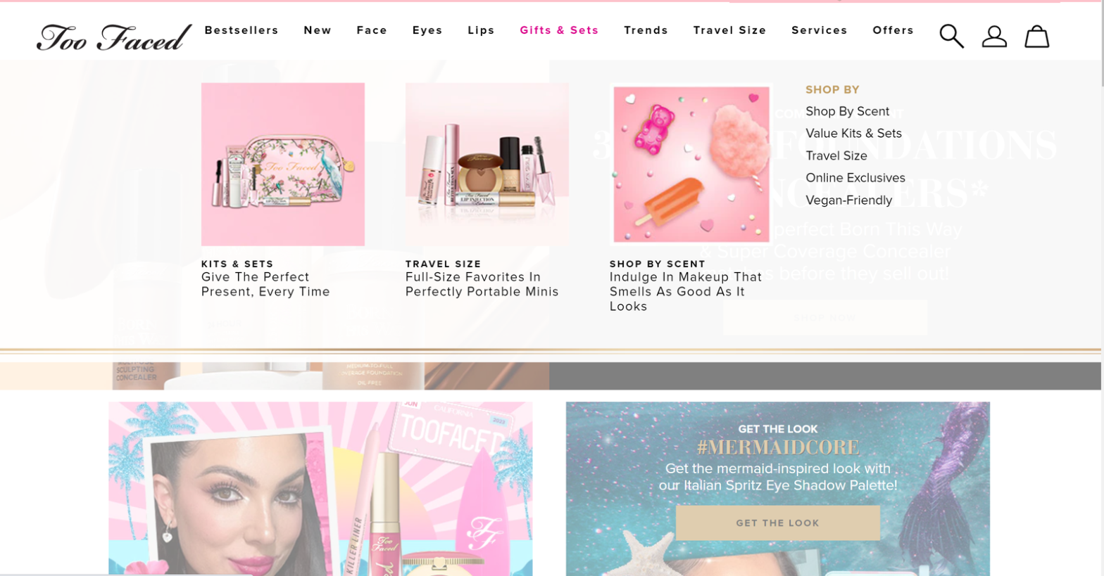
A good example from Too Faced:
When a user selects a particular category, such as “Gifts & Sets,” on Too Faced website, it becomes visually distinguished by its color changing to pink.

Conclusion:
In our ongoing exploration of navigation strategies for improved CRO of e-commerce websites, we have explored the significance of elements such as breadcrumbs, a “Back to Top” button, prominent calls-to-action (CTAs), and visual cues. These components play vital roles in enhancing the user experience and facilitating seamless navigation. On the next article of this series, we will write explore the importance of gathering user feedback and conducting usability tests to identify potential pain points and optimize the navigation experience further.