The PDP page, also known as the product detail page, is one of the most critical factors in converting a user into a customer. A user who has navigated from the home page, selected categories, and passed through the PLP page to reach the PDP page can make their final decision and add the product to their cart by following the correct and standard data and flow. Therefore, it is crucial to observe design principles, UX, content, and other factors on this page.
In this series of articles, we have provided guidance on all the necessary points for building a standard and user-friendly PDP page, along with examples from real websites.
In this article (the first PDP article), we attempted to collect and present the points related to the overall layout, product titles and descriptions on the PDP page.
Standard layout:
Do you use the standard layout of the product page? (Desktop and Tablet view)
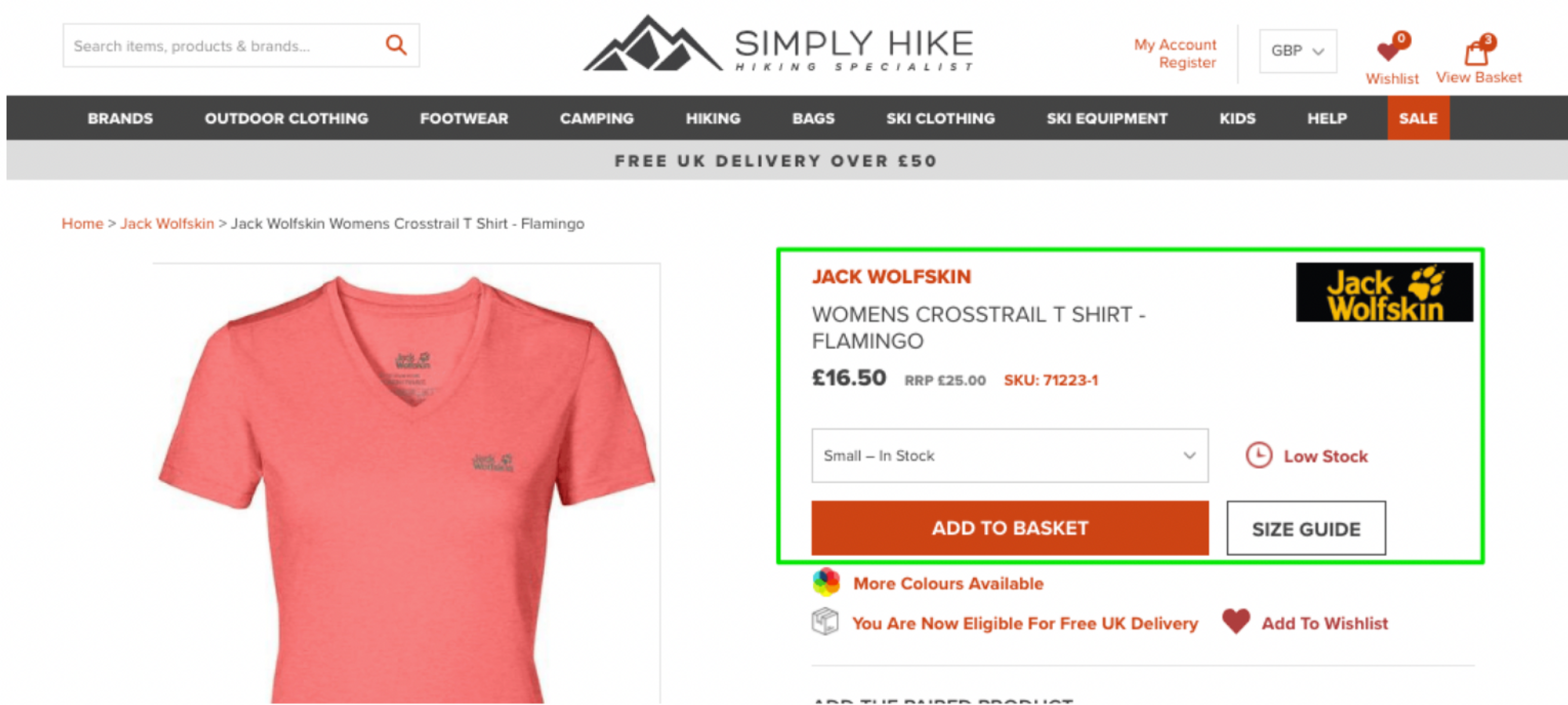
Users are accustomed to product pages that follow a standard structure, which includes the following:
- The photo gallery is situated on the left-hand side.
- The title, price, product variations, buy button, and other details are located on the right side.
Therefore, if you do not use this standard structure, or change it every time, it will cause the user to spend more time finding the information they need on your website’s product page. Especially in e-commerce websites, it is recommended not to design the page differently from what users have been accustomed to for years.
Of course, today we also see some websites that design their product page as a landing page. If you also want to use a different structure in designing this page, we suggest that you first test it among different users to make sure of its proper functionality.
Good examples of e-commerce websites that use standard design include:


Does your product page pass the “5-second test”?
The “5-second test” involves showing a product page to users for just 5 seconds, followed by asking them questions to determine how much important and necessary information they could extract from it. If a user cannot view the product title, images, price, and CTA button during this brief period, it indicates that the structure and design of the page are incorrect, which can cause confusion for users.
In addition to conducting this test, it is crucial to pay attention to the following factors:
- Loading speed: If the product pages take a long time to load, it can cause users to lose interest and close the page. Therefore, it is recommended to use small-sized elements on these pages.
- Prioritize mobile optimization: Nowadays, a high percentage of users use mobile devices for their purchases. Therefore, it is better to design the product page for mobile devices first and then expand it for larger screens.
- Breadcrumbs: When a user reaches their desired product through a specific flow such as search or filtering, we should show them the path they have taken so that they do not need to search or filter again to access other product pages.
Do you group together the “big four” pieces of information?
When we talk about the need for a standard product page structure, it means that we should display the “big four” elements prominently and in the same section on this page. These four elements are:
- Name of the product
- Price
- Availability
- “Add product to cart” or equivalent
But why should these four elements be placed close to each other? Customers would be looking for these information, before adding an item to their basket. And when we place this information close to the main CTA button, we help them get to their needs faster.
A good example of the cases mentioned above:

Title and Descriptions:
Do you have descriptive product titles?
The title of a product should contain all the necessary information that customers are seeking so they can quickly understand what they are getting. Descriptive titles can assist customers in this regard.
Here is a simple guideline for writing product titles:
- Keep the title short but descriptive.
- Include the key benefits of the product in the title.
- Add the primary keyword for SEO (every word in the title is an important keyword for organic search visibility).
- Include important features of the product in the title (such as brand name, types, sizes, materials, etc.).
Additionally, a practical table has been prepared for structuring product titles on e-commerce websites, which you may also find helpful:

You can see an example of a bad and a good product title on a website in the image below:

Do you explain benefits (not just features) in detailed product descriptions?
When writing a product description, it is important to highlight all the benefits it offers to the customer, rather than just its features. Features, such as how the product works and its dimensions, are important, but benefits are what really sell a product. Benefits refer to the services a product can provide to the customer, such as simplifying their life, saving them time and money, or enhancing their appearance. It’s important to remember that when introducing a product to a customer, you’re giving them a sense of what it’s like to use it.
A great example of a benefit-driven product description is:

Are all the specs available in the product description?
Customers who consistently buy certain products are searching for particular information about those products in the description. For instance, users who purchase building materials are always looking for more detailed and precise information about the product. Thus, including specs in the product description can increase your loyal customers.
Even on retail product websites, where it is not possible to provide a lot of specific information about small products, we can outline a set of features of these products so that customers can have a broader understanding to choose the product.
For example, would your online clothing store be appealing to environmentally conscious customers by providing details on how sustainable clothing is produced?
In conclusion:
To wrap up, optimizing your Product Detail Pages (PDP) is crucial for driving conversions and maximizing your e-commerce success. We have delved into the essential elements of a high-converting PDP, including the impact of a well-designed standard layout and the art of crafting compelling titles and descriptions. In our next article, we will explore the significance of product images on PDPs and how they can further enhance your conversions. Stay tuned to discover powerful strategies for leveraging product images to their fullest potential.