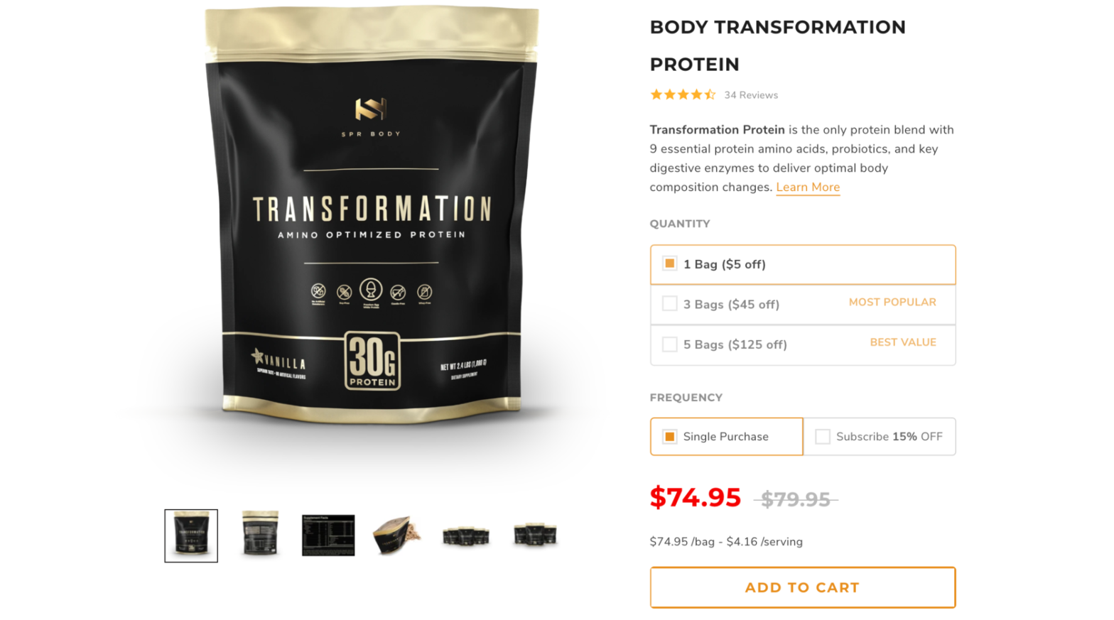
The PDP page, or product detail page, is one of the most important sections for converting users into customers. In the previous article we discussed some points about layout standards, title and description, and product image gallery. In the second PDP article, we intend to present some points about product variants, and other product details.
Product Variants:
Do you use selectors (buttons) for product variants (colors, size, etc.) instead of dropdown lists?
The better the UX of product pages, the easier it is for customers to navigate. Therefore, the simpler the experience for customers, the higher the conversion rate. In order to achieve this, we need to eliminate any unnecessary actions from the page to simplify it. When using dropdown lists to select different types of products on the page, an additional action is added to the page.
There are problems that arise from using a dropdown:
- If the user does not click on it, they will never know which options and sizes are available for the product.
- When we use selectors instead of dropdowns, users can compare different types of products more easily, especially when it comes to color.
- In dropdown lists, users must first click on the dropdown to select a type of product and then choose one of the options (2 actions). Whereas for selectors, it is enough for the user to click once and select their desired option (1 action).
Since mobile traffic on e-commerce websites is much higher compared to other platforms, and simplification on this platform is also crucial, it is essential to avoid using drop-down lists on the product page and instead use selectors.
A good example from Fashionnova website:
On the product page of this website, selectors are used for both color and size selection, which creates a better buying experience for customers.

Do you provide users with a size chart if you sell clothes?
If you do not provide a size chart for your website’s products, customers will be unable to make informed decisions about the appropriate size for them. The more uncertain a customer is about the size, the more likely you are to hinder the buying process, leading to a negative impact on e-commerce conversions and sales.
Furthermore, if you sell a product that does not fit the customer’s size, you will also be responsible for the return process and refunding the customer. This results in additional costs and work for you.
A good example from Gymshark:
On the product page, there is a link called “size guide” that allows the user to see guidance for selecting their size in a separate modal. There is also a selector for different sizes next to it that allows the user to select a size and purchase the product.

Are customizable options (like color, size, gift wrap etc.) clearly visible to the user and are they easy to use?
Nothing can be more frustrating than having customization buttons on a product page that do not work. If your website offers products that come in different sizes, colors, and variations, ensure that the options available on the product page function correctly.
Another effective design solution is to place the customization buttons close to the primary call-to-action (CTA) button on the page. This will assist users in quickly selecting their desired options and clicking on the primary CTA button to complete their purchase.
A good example from the Puma website:
In this website, there are various product options located near the main CTA.

Other Product Details:
Is product information easy to read and scan?
On a product page, the information should be written in a clear and easily readable manner so that the user can quickly scan and extract the necessary details. When writing product information, attention should be paid to factors such as font type, size, paragraph length, subheadings, bullet points, and white spaces. However, in general, the following guidelines can help make the product page information completely readable and scannable:
- Use headings and subheadings to separate different sections of product information.
- Use short paragraphs that do not exceed 4-5 lines.
- Use bullet or numbered lists.
- Highlight important information by using a larger font size or a different design.
- Use images or graphic icons within the text to attract the user’s attention.
A good example from Qualockase website:
The text on the Qualockase website product pages is completely readable, with clear headings, bullet-pointed information, and short paragraphs.

Do you show relevant units for products where information about dimensions (size, weight, lengths, etc) is important and do show dimensions at all?
If you are selling products for which dimensions are important to the customer, it is essential to provide the customer with information related to size, weight, measurement, length, etc. before the customer finalizes their purchase.
For instance, if you sell furniture, the dimensions of the product are crucial, and if your customer is from the US, displaying the product dimensions in centimeters would not be helpful because they use inches for measurement. On the other hand, for residents of Brazil, using centimeters to show the dimensions would be more appropriate.
Therefore, it is essential to pay attention to small details such as measurement units.
A good example from the REM-FIT:
Since the product is intended for the UK market, it should display the dimensions in centimeters and kilograms

Conclusion:
Optimizing product variants and other key information on your Product Detail Pages (PDP) is paramount for driving conversions and creating a seamless shopping experience. By offering diverse product options and presenting easily accessible information, you can engage your audience and instill confidence in their purchasing decisions. In our next article, we will explore the crucial aspects of price and payment options on PDPs and how they can further enhance your CRO.
